
It seems with bug and issue trackers, the default is to drop all of the data into a tabular format. While it’s easy and works great for numerical data, it’s never felt right to me for text-centric data, let alone task-oriented data. Tables, by design, put an equal amount of emphasis on columns (attributes) and rows (records). The underlying assumption in a table is that it’s equally valuable to quickly compare columns as it is to compare rows.
With bugs and issues where each of the attributes are inter-related with other attributes, the value of each column individually is diminished. For instance, a “critical” priority on an issue isn’t really all that critical if the issue is closed. Bugs and issues are, at their core, simply fancy todos. It’s a todo list. Not a todo spreadsheet. There are elements of todos where a tabular format helps, but it’s overkill to drop every single piece of data into a dedicated column.
In a subtle, but telling way, this has become more obvious to me based on how I explain what Sifter is to friends and family. Whenever non-technical people ask me what I do, I always end up telling them that I built software that is a "fancy team todo list’. Sifter isn’t a spreadsheet for tasks, it’s a team todo list, and I’ve been trying to think more in terms of tasks and less in terms of attributes.
Today, while the data isn’t in a table, it might as well be as it’s simply dumped out there as “groups of attributes”. It works, but it’s not very elegant. There’s way too much noise and distraction. In part, this was a result of a fixed-width two-column design, but that was a poor decision for the issue listing page that we’ll be rectifying soon.
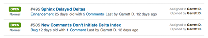
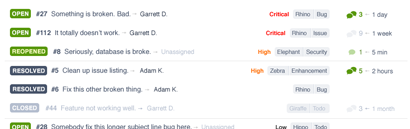
The new version places an emphasis on tasks rather than “groups of attributes”. It also helps give each row a more unique visual signature so that they don’t all blur together and look the same. This helps make it easier to quickly identify issues and distinguish them amongst the others in large lists.
Horizontal Spacing, Rigidity, and Alignment
The biggest challenge that tables bring is that they are incredibly good at forcing you into a structure that can quickly waste horizontal real estate because each column has to be as wide as the longest data point in that column. This disconnects the attributes from each other and makes it increasingly difficult to view each row as a connected piece of data.
Similarly, depending on the alignment, data points end up becoming more closely related to their columnar siblings than their row siblings, and the tasks end up as fragmented bits of data rather than atomic todos.
Data Relationships
When you’re simply display numerical data, there’s rarely a case for communicating relationships between two attributes within the table because that’s the purpose of graphing and visualizing data. However, when most (all?) of your data is text-centric, there’s a strong case for more closely grouping and associating related attributes.
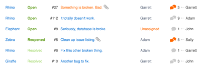
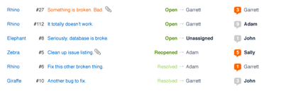
With each task, there’s the primary information that you need to discretely identify any given issue. That is, there’s information that uniquely identifies an issue, such as subject or number, that will be unique the majority of the time. This is the primary information.
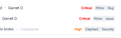
Then, you have the secondary information which are attributes like status, priority, category, project, assignee, etc. These attributes have varying degrees of value in determining what to work on next, and thus, have a different relationship with the task itself.
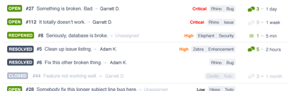
Priority, category, and project are effectively tags. Priority is special, and thus gets a special, more prominent, treatment. Similarly, you’re more likely to sort by priority to determine the list order and work from top to bottom than you are to want to choose an issue simply by priority. As a result, it straddles the line between primary and secondary information.
Summary
Instead of swimming through columns of data and fighting the rigidity, we’ve chosen to emphasize each task individually and approach issue lists as just that. Lists. Not tables. The emphasis is on the work that you need to do, not an arbitrary structure imposed on a context where it doesn’t make sense.