
Sifter’s been live for over seven years now and is rapidly approaching eight. During that time, I’ve been dogfooding it, listening to customer feedback and questions, digging into business and usage metrics as well as analytics about our help site. Combined, this has provided an incredible amount of information about where Sifter has fallen short. Now we’re making some improvements to address those shortcomings, and I want to candidly share what they were and show how we’re addressing them.
Nothing in my career has helped me grow as a designer more than doing front-line support for my own design work.
One thing is for sure. Nothing in my career has helped me grow as a designer more than doing front-line support for my own design work. With Sifter, I’ve made and learned from more mistakes than I’d care to admit, and, as we start to address those mistakes, hopefully this sharing can help others avoid those mistakes.
A Quick Preview
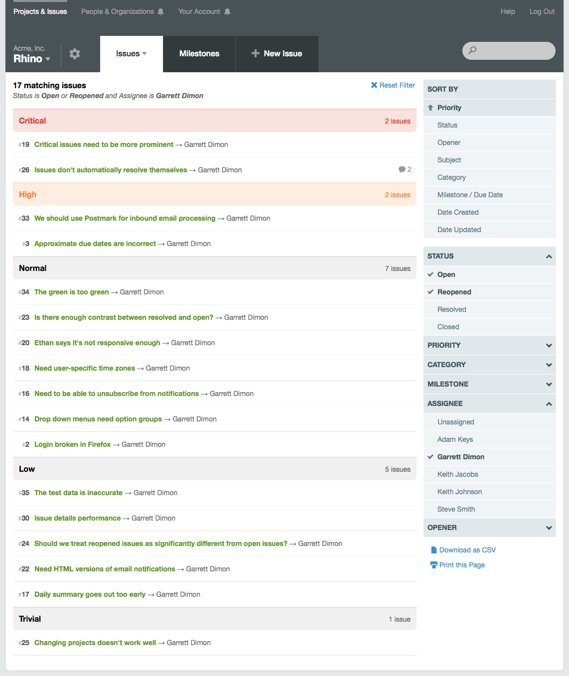
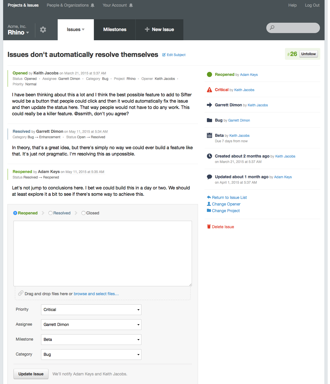
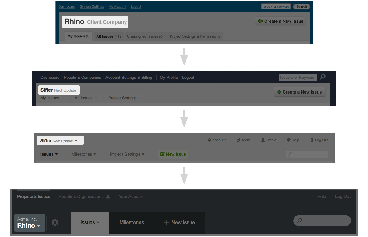
I’ll start off with a few preview screenshots of key pages within Sifter. These will help provide context as we review the mistakes and resulting changes from previous iterations. While the changes reach throughout Sifter, looking at the issue listing and issue detail pages provide a pretty good idea of the difference. 1 & 2
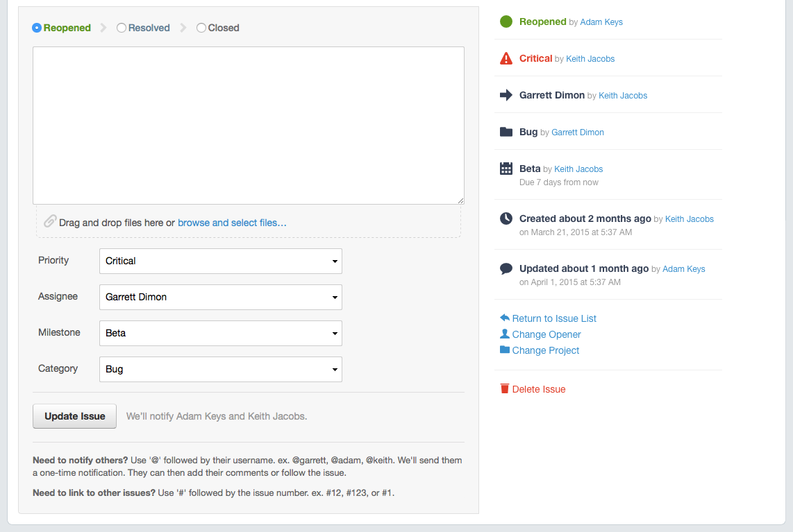
Most of the focus has been on the navigation and notifications, but we’ve also made a few other improvements like sticky issue attributes so that you can always see the current state of the issue no matter how far down the page you’ve scrolled. 3
One thing you may notice is the degree to which these updates should feel familiar despite the significant improvements in usability. We want to improve Sifter without forcing everyone to relearn the application interface from the ground up. If there are any other lessons that I’ve learned over the years, it’s that even modest changes to an application’s interface can drastically hurt folks’ productivity. Changing too much too drastically at one time, no matter how good the improvements seem, will invariably hurt some customers. So it’s generally better to work towards evolution rather than revolution.
So what was wrong?
Few people, if any, will ever ask you to make your application easier to use. If it’s difficult to use, they just move on. And, if an application’s usability slides over time, it’s not immediately obvious. It’s sort of death by a thousand cuts compromises. Over the years, I became so caught up in focusing on the tangible features that folks requested, I failed to spend time on the parts of Sifter where I knew things were wrong but didn’t have any explicit customer feedback to justify the time to make the changes.
Changing too much too drastically at one time, no matter how good the improvements seem, will invariably hurt some customers. So it's generally better to work towards evolution rather than revolution.
Finally, I set aside some time to fix the areas of Sifter where I felt things had become less than impressive. These adjustments are based on some personal preference but also from listening to underlying messages when talking to customers. Instead of simply showing what’s new, it felt like the best explanation is to share the updates in the context of the mistakes that drove the changes.
Mistake #1: Too Much Reduction
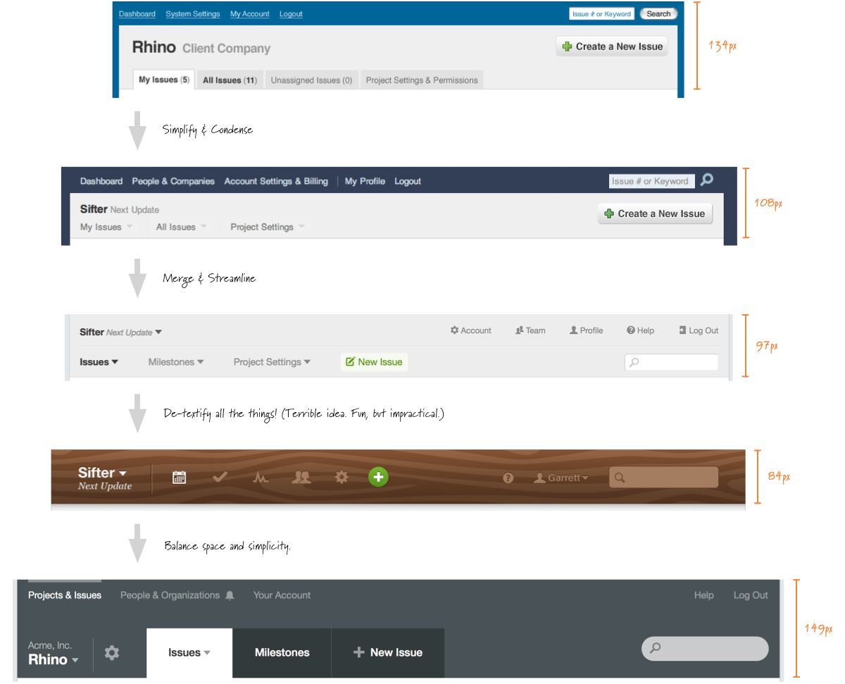
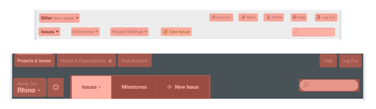
I tried to reduce the visual footprint of the header to enable more of a focus on content. While I wasn’t specifically trying to make it smaller, I was trying to simplify the navigation to create more emphasis on the content. Boy did that backfire. This led to compromises in labeling, navigation, and structural hierarchy. The header’s footprint was reduced, but so was its usability. 4
Mistake #2: Lack of Hierarchy & Context
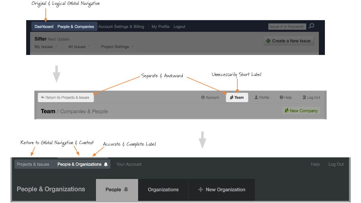
One element that’s been consistent throughout these iterations is the approximate placement of the project and company name that shows you which project you’re currently working with. 5 Unfortunately, as important as this element is to defining the context of the page, even subtle changes to its placement can confuse the issue rather than clarify it.
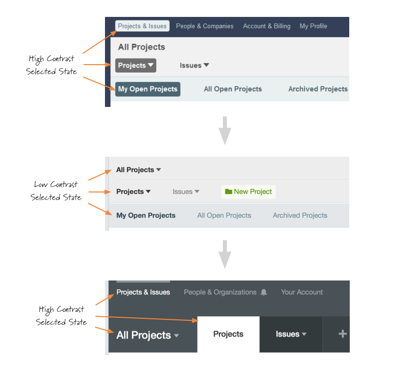
It’s subtle, but the relationship of the project scope to the other elements in the header became less obvious. This was compounded by two things. First, the project switcher and the project navigation had approximately the same visual weight. Second, the horizontal line in the header visually grouped the project switcher with the global navigation. 6
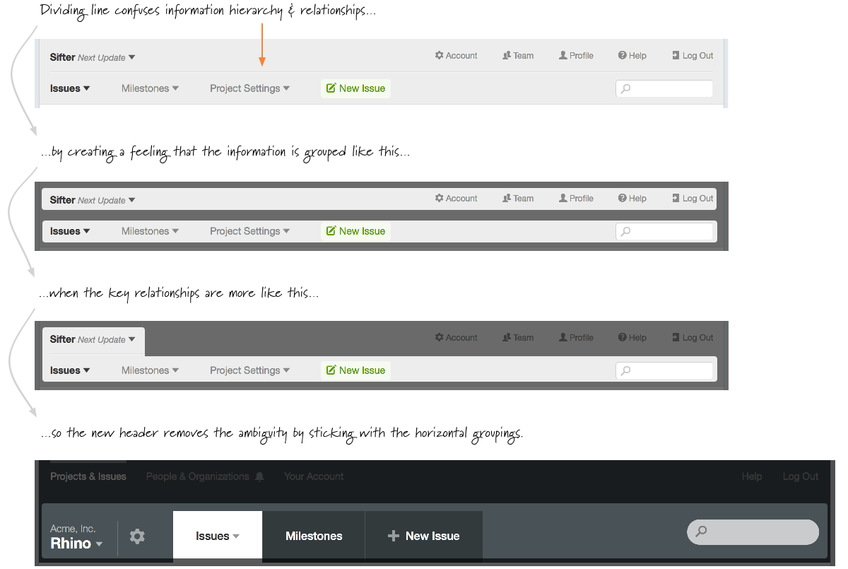
Since all elements in the header had the same visual weight, there was little hierarchy. It didn’t matter if people only used the “Project Settings” links once a month. It’s just as big. Actually bigger considering it has more letters and words. This created visual noise. With the new header, project settings is clearly tied to the project and decreased in visual significance and size while still being readily available.
Few people, if any, will ever ask you to make your application easier to use. If it’s difficult to use, they just move on.
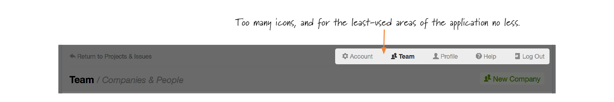
One of the biggest sacrifices before this new update was losing the context of where you are globally within the application. To hack around it, I came up with this concept of “Return to projects and issues” when you had to manage your account, profile, or users. This reduced important context helping you know where you are within the application. 7
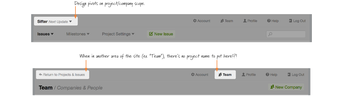
When you weren’t in the scope of a project or all projects, we didn’t have any relevant navigational elements to put there. If I had truly been paying attention, I would have recognized this as a sign that we were going in the wrong direction. Instead, I doubled down and bolted on the return link. 8
Mistake #3: Poor Visual Grouping
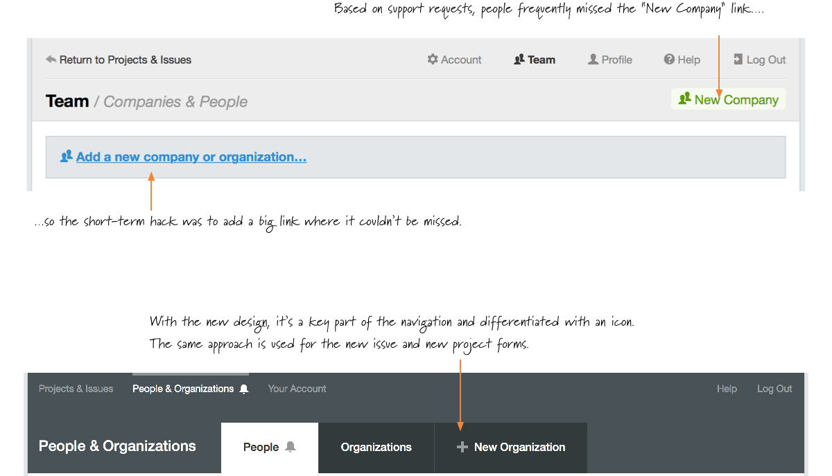
One of the best examples of support requests exposing problems was the frequency with which people were concerned that Sifter didn’t offer a way to group users into companies or organizations. The “New Company” link was different, but it was set off to the right side and not quite as obvious as it could be. I temporarily corrected this by adding a rather obtrusive and clunky link to “Add a new company or organization…” right at the top of the page so that it couldn’t be missed. 9
You might also notice a switch from “Company” to “Organization” for the terminology. This change was made to support the fact that not all groups of people are technically companies. Many of these are “non-profits”, for which the word company feels awkward. Moreover, some customers use them as departments or teams. At the time of this writing, I’m still tempted to use the word “Group” in place of organization, but I’m afraid that it’s too casual and doesn’t make it clear enough that the divisions are significant. We’ll see.
Mistake #4: Lack of Variation & Poor Weighting
In addition to the mistake of making the header smaller, I also reduced the variation. The result was an attempt to design the header around the project scope because it was the key navigational and way finding element. Trying to save space, I reduced the navigation selected state to the smallest effective difference. 10 That is, the selected items were simply made bold. This can work in some cases, but the effect was too subtle and decreased the perceived clickable area. (More on that later.)
Along those same lines another subtle mistake was treating the “Project Settings” link like just another primary navigtion link despite the fact that it wasn’t accessed anywhere near as much as the other primary navigation links. 11 With the new header, the project settings link becomes one of the few icons in the header.
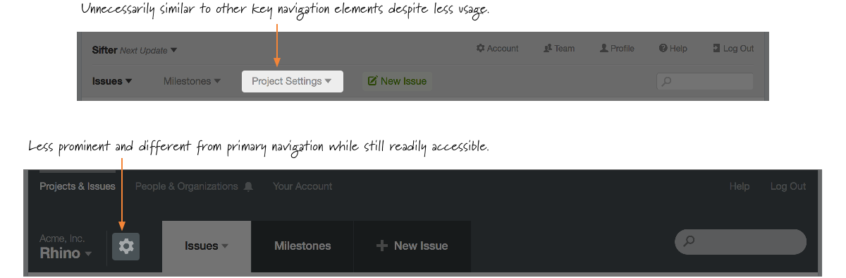
Switching from the verbose “Project Settings” to a simple gear icon accomplishes several goals:
- The icon saves space since the gear is a fairly universally accepted icon for representing settings.
- The smaller size makes it easier to place the link in closer proximity to the project name making it more intuitive.
- It visually differentiates the project settings from the other more commonly used elements.
The earlier iterations led to smaller but less intuitive header, and we stuck with it a little too long. Few people ever send visual design feedback, but by paying close attention to customer support requests and analyzing the stats for our help docs as well as traffic and usage, the mistakes became visible. The navigation and header didn’t correlate well to folks’ usage patterns and mental models. These subtle but important changes all come together to make navigation much easier and faster.
Mistake #5: Clunky Information Architecture
One other long-lived mistake was the separation of “profile” and “account.” 12 Profile is focused on personal information like name, password, and email while the account area is about billing and account management. The only real distinction is that account management is only available to the account holder, and that was the original distinction that drove the separation.
That distinction matters to us internally, but it’s not important to customers. The links or tabs are either present or not. Unifying all of the possible settings and administrative options into a single area makes profile and account management that much easier and does a better job of exposing all of the options available.
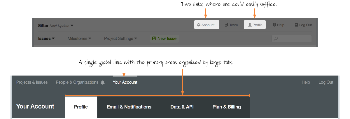
With the ability to create issues by email, our bounce handling notifications, and plans to extend our notification options, the existing structure was too rigid. Similarly, over time, we’ve expanded the options for accessing your data. So we needed to create a central location for summarizing your options for exporting data. Unifying account and profile makes it easier to unify related information while still being able to adjust the available options based on user roles. With this subtle change, nobody ever has to wonder whether they want to check under profile or account, and we can more easily expand and improve individual areas without overwhelming a single area.
Mistake #6: Tiny Targets
In hindsight, it should have been immediately obvious just how small the click targets had become for the primary navigation. This one is embarrassingly obvious in hindsight since it was a regular frustration of mine. But for whatever reason, I overlooked this.
With the new header, not only are the most important elements visually larger than other nearby elements, but the associated clickable area is increased as well. And, going a step further, there’s increased whitespace between disparate elements to help minimize accidental clicks.13
Mistake #7: Useless Iconography
Somewhere along the way, I fell in love with icons. Deep down, I knew better than to just slap icons here and there, and yet, that’s what I did. Icons are great for differentiating or reinforcing, but I used them as a design crutch rather than a useful element.
Since all of the navigation elements ended up being approximately the same size and weight, I decided to add something to help the global links stand out in their own way. So, instead of improving the navigation, now I was emphasizing the least used links in the whole header. 14
As if that wasn’t bad enough, as I started exploring ideas for this new version of the navigation, I spent an incredible amount of time playing with an approach that went even further with icons to the point of designing a mystery meat navigation structure with a wonderful little wood grain. 15
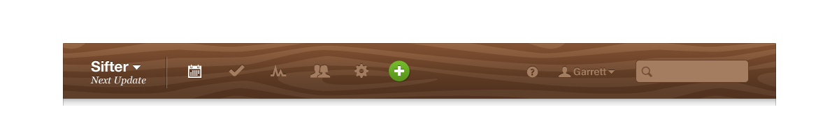
Had I not shared that work with anyone, I probably would have moved on without getting too deep into the rabbit hole. However, because it was kind of fun, I shared it, and the reception to the mockups was very positive. Of course, with mockups, nobody is actually trying to use and interact with the design. They’re just commenting on the artfulness of it, so they had no idea how painful it would have been to use. I knew that, but I got carried away thinking I could make it work.
The more I explored that approach, the more I realized that it was more pretty than functional and eventually moved on. Since moving away from that approach, I’ve run across several applications that use a similar approach, and while pretty to look at, they were frustrating and confusing to use reminding me that mystery meat navigation is never a good approach.
With the new header, both typographic weight and physical location help reinforce the purpose of the global navigation elements while improved labeling reduces the need for iconography. Icons are always best when used judiciously.
Conclusion
I can’t say it enough, but nothing has improved my awareness and empathy as a designer more than doing front-line customer support for my work. Even when a customer isn’t providing direct feedback about something, the frequency of a given question or situations with confused customers speaks volumes about where I’ve gone wrong. Help Scout 1 has been huge in furthering that insight through these reports. 16
While this update ended up being much farther reaching than we anticipated, when you really look at things, it’s not as drastic as it seems at first glance. Some elements have shifted a little. Almost everything has been streamlined. But across-the-board, it should feel very familiar. Just better. This method of approaching improvements as evolution rather than revolution helps us make life better for customers while minimizing the burden of using a new interface.
Ready for more? In the next article, we explore the updates to Sifter’s notification and alerts and dive into the improvements and underlying design decisions driving those changes.
- Help Scout is fantastic, and I can't recommend it enough. The reporting is helpful, but it's only a drop in the bucket in terms of its impact on our ability to serve our customers better.↩