
Alerts and notifications are an inextricable element of software design, yet they rarely receive the attention that they deserve. Despite being one of the primary means of communicating between software and user as well as being the first line of defense when things goes wrong, alerts and notifications are notorious for being neglected.
Despite being one of the primary means of communicating between software and user as well as being the first line of defense when things goes wrong, alerts and notifications are notorious for being neglected.
Sifter was never the worst offender, but we certainly weren’t going to win any awards for our notifications. Don’t get me wrong, we still aren’t going to win awards, but the situation is much improved, and with our upcoming update to Sifter, I saw updating the header and notifications as almost going hand-in-hand. Now we have a solid foundation upon which we can improve.
It feels odd diving into the details and considerations for designing notifications, but these updates really make a huge improvement in the overall experience of using Sifter.
Why are alerts and notifications so hard?
Alerts and notifications have a perfect storm of complexity to make them one of the more challenging parts of interface design. Creating notifications that are helpful and visible without getting in the way is a difficult balancing act. When you break it down, there are quite a few factors at play that lead to these challenges.
- Transience Notifications aren’t always visible. So they receive less attention.
- Prioritization “Fix me now!” vs. “Take a look when you get a chance.”
- Varying States Dismissible vs. Permanent vs. Temporary
- Usage & Purpose Interactive vs. Informative
- Context Success vs. Failure
- Content Succinct vs. Detailed
- Audience Account Holder vs. Administrator vs. Everyone
Each of these variables introduces its own level of complexity. Mix them all together, and you have a fairly complex multivariate design equation. Creating a flexible and consistent framework to support with all of the possible scenarios can get messy.
Let’s look at a quick example. While we want to tell an account holder that their account is frozen because their credit card was declined three separate times over a week, we should probably tell their end users only that the account is temporarily frozen and to contact the account holder without any mention of billing issues. Similarly, while the message for the account holder is of the “Fix me now!” variety with an actionable next step, the message for the other folks on the account is only informative/explanatory with no explicit action that must be performed. Depending on the audience, both the severity and content will be different.
Just how many different alerts are there?
Over time, with new features, interactions, and pages, the visual design for Sifter’s notifications and alerts had become increasingly, uhm, let’s call it “eclectic.” An extra notification here. One there. Lots of fragmentation. Not a lot of continuity. But, before we dive into the specific mistakes, let’s run through the various types of notifications and alerts.
Account Alerts
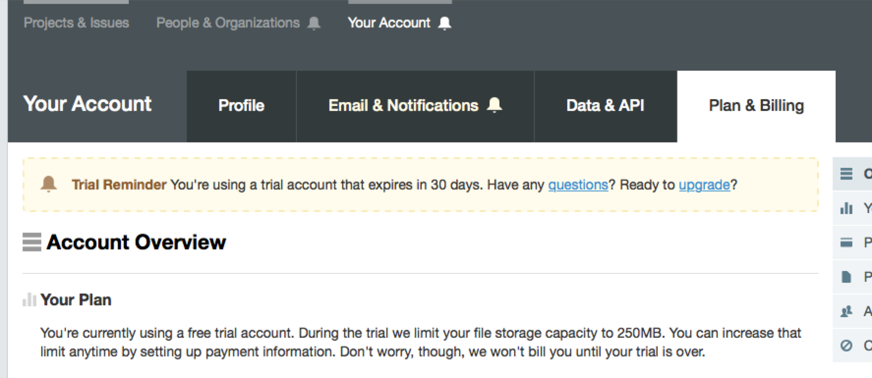
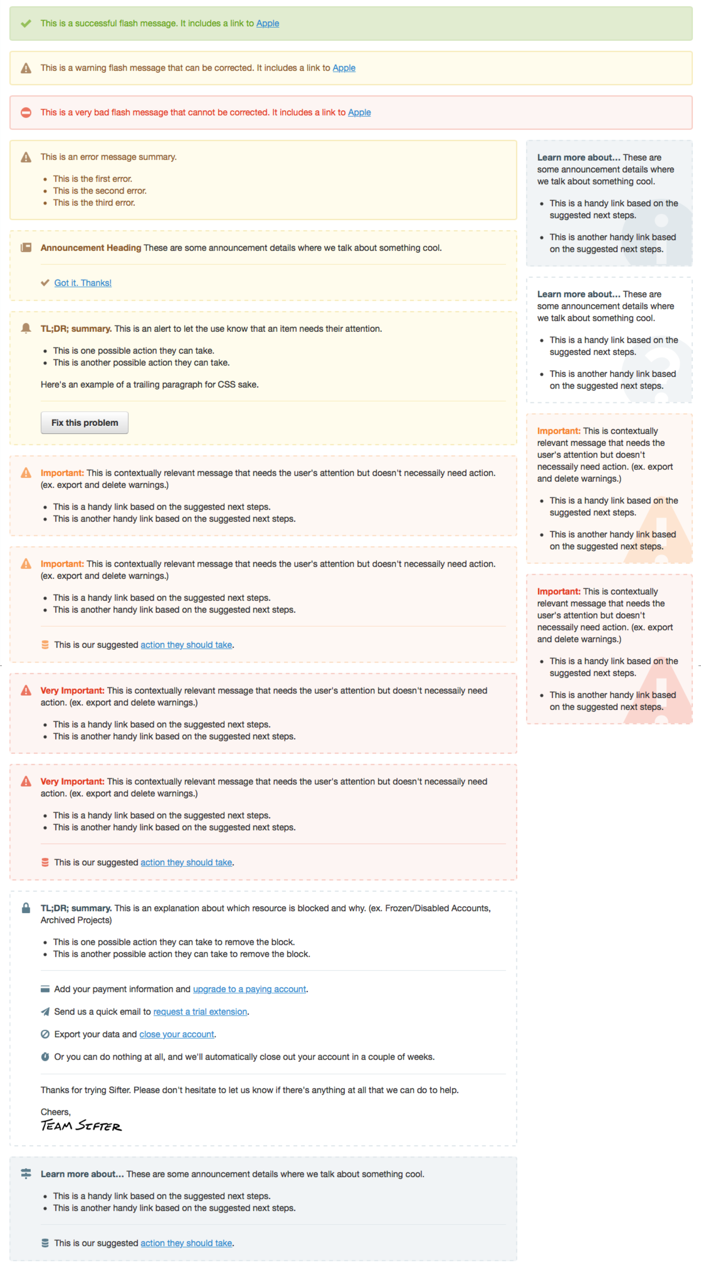
These include billing problems, trial expiration warnings, and that sort of thing. The account holder is the only person that will ever see these. However, in the case of a frozen account, we still need to present an explanation to everyone else. 1
Bouncing Alerts
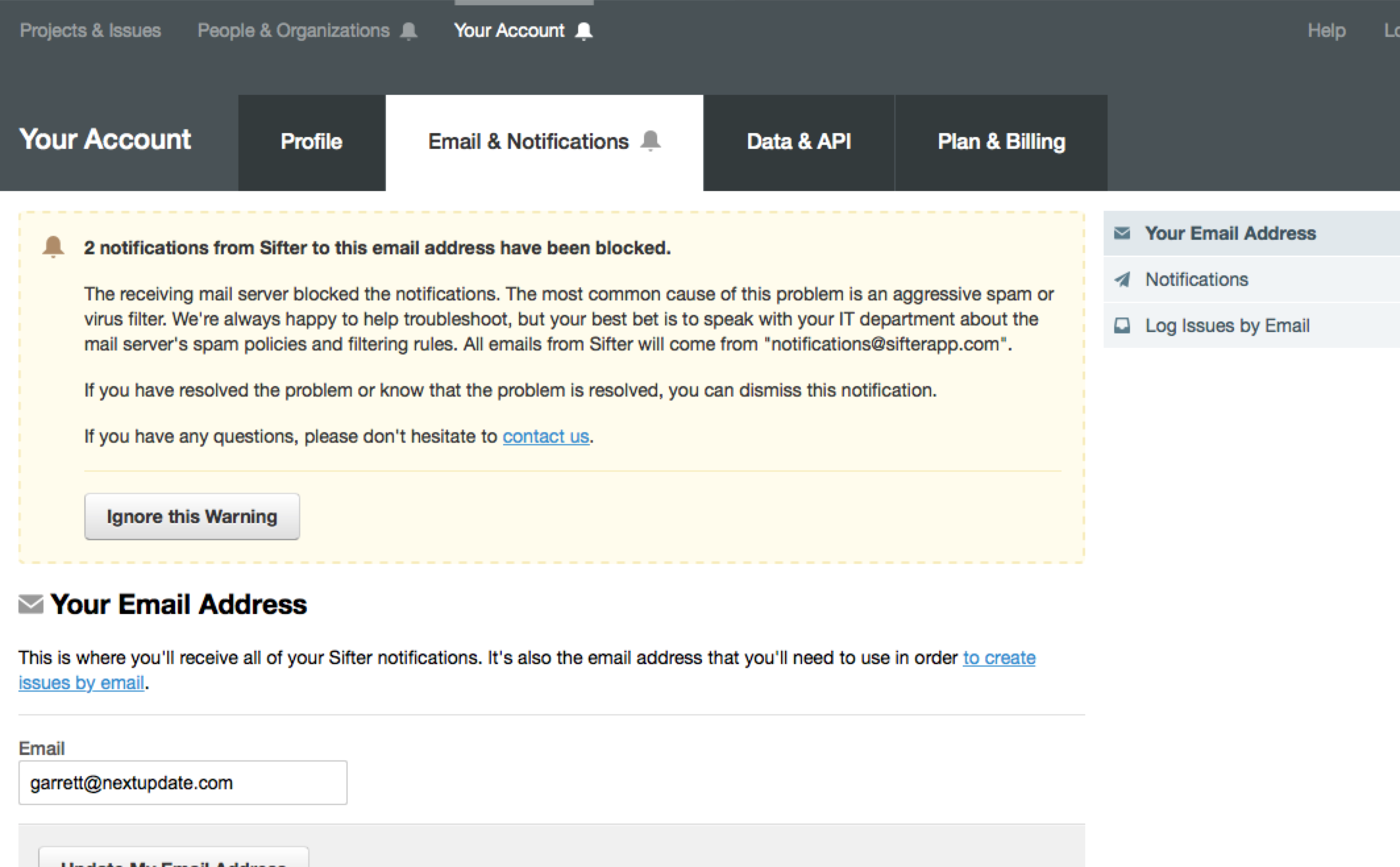
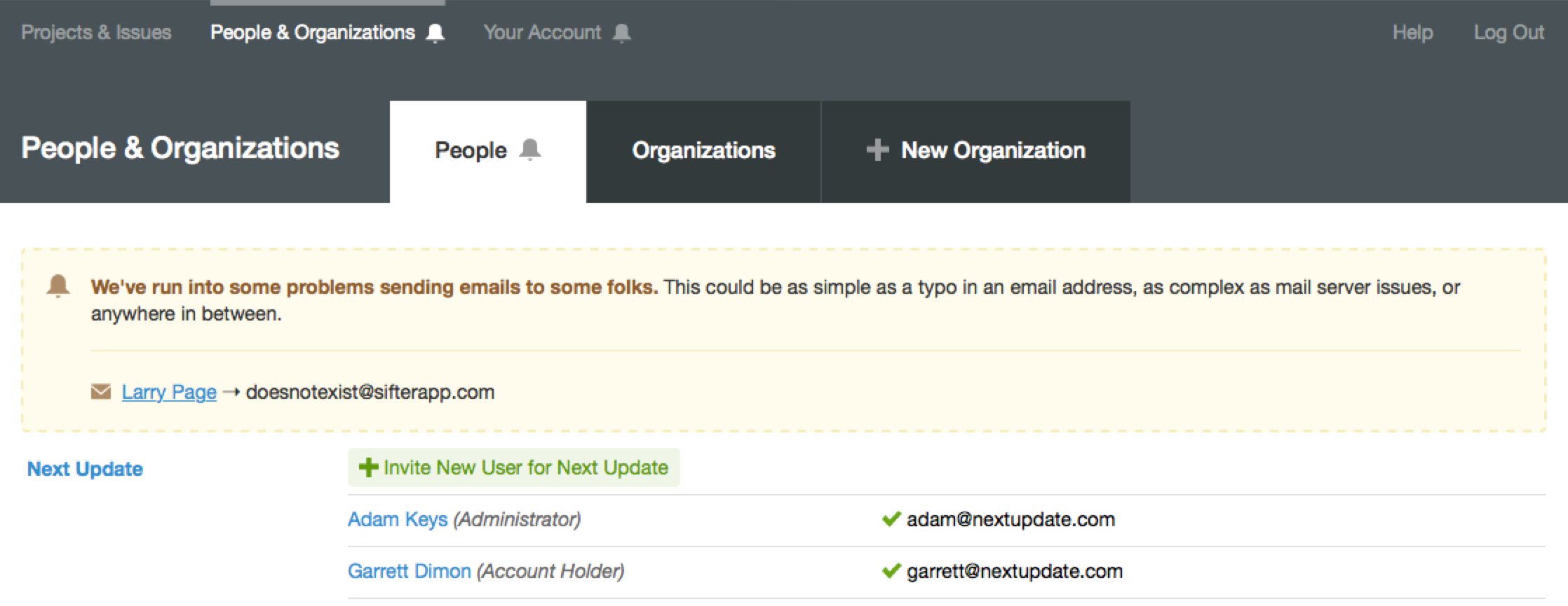
Sifter has extensive bounce handling in place so that we can let folks know whenever we have delivery problems to a specific user’s email address. 2 These notifications help people get to the bottom of things and get delivery back on track. These become complex due to the diversity of email delivery problems. 3
Flash
Flash messages are generally for confirmation of an action, but they come in handy in other ways as well. For clarification’s sake, in this context, I’m referring to the Rails terminology where “flash” is a temporary session-based message passing system rather than Adobe Flash. 4
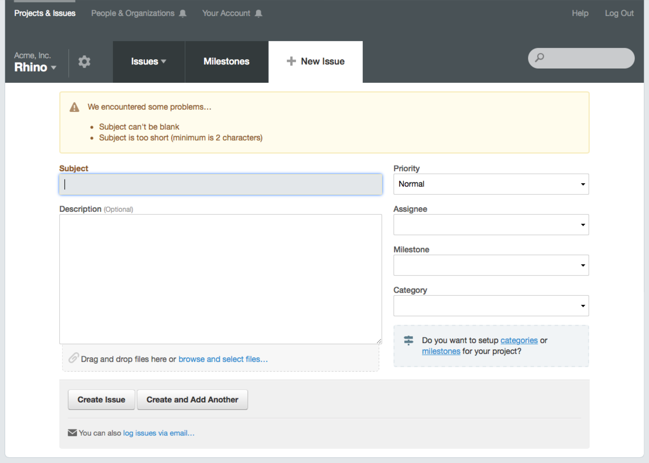
Errors
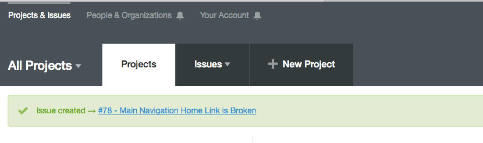
These are the temporary messages to either confirm the completion of a user-initiated action or alert the user to errors with their submission. 5 These are fairly standard, and we haven’t done anything wild here. I envision a lot of room for improvement in the future, but since these are so closely tied to forms and the associated interaction, I felt it made sense to significantly improve these in conjunction with improvements to our forms.
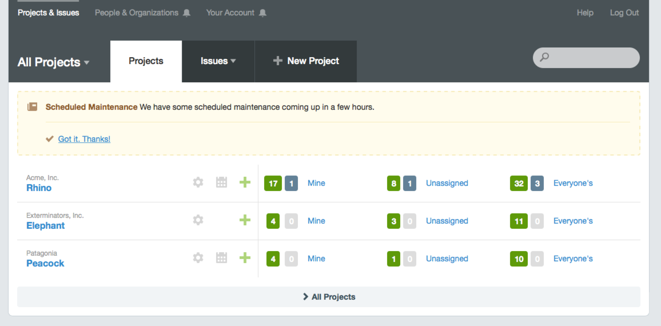
Announcements
Announcements help keep folks in the loop on things like new features, system maintenance, or downtime. 6 These are not pressing issues, but maintaining reliable communication with customers helps them get the most out of Sifter. Long-term, we’re working to make news and announcements a more significant feature within Sifter to help customers take advantage of and learn about features, but we had to cut scope somewhere for this release.
Warnings
On any page where folks are able to do irreversible damage and delete large amounts of data, we want to make it crystal clear what’s happening so there’s never any regrets. 7 In some cases, these messages can present alternatives to deleting the data. For instance, when deleting a project, we suggest that they archive it instead.
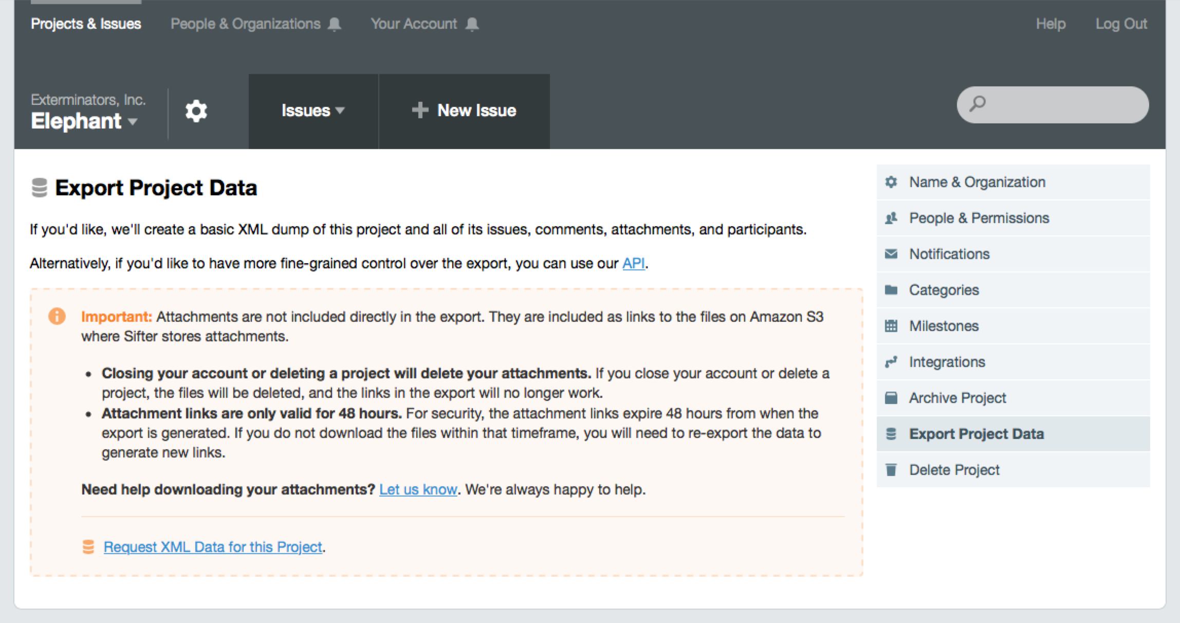
In this example, since issue attachments are stored with Amazon S3, they aren’t included in the export and require some extra effort to obtain. When customers need attachments upon exporting their data, we have a script that can download them. This is currently a manual process, but eventually, we’ll be able to automate it and the warning will be unnecessary.
This is a simple example of compromising on where we invest our time. Using an attention-grabbing notification here is a sign that we can improve the underlying functionality, but as infrequently as it’s used we improving it in baby steps.
Tips & Suggestions
With all of the questions we receive, we’ve found that it’s really helpful to include some tips and links to our help docs directly in the page. 8 Helping expose these questions and answers helps save our customers time emailing us and helps us save time replying to those emails. Customers get more done. We’re able to focus on improving the product.
These aren’t traditional notifications, but they are still an important means of increased communication with customers. They definitely still fall under the category of helping people use Sifter and get the most out of it with the least effort. And for our customers, clicking a link is much easier than emailing us a question.
Related Alerts
There may be a better name for it, but we’ll go with “Related” for now. In some cases, for instance if a user’s email address is bouncing, that can affect other areas of the application. So, while we don’t want to have bulky notifications on every page, we do need to remind them that a related feature might also encounter problems if they don’t address a related issue. 9
So how did we go wrong?
All of these different contexts, combined with the variations of alerts create a lot of room to make mistakes and do a poor job of communicating via alerts. Fortunately, I have some very specific mistakes and lessons learned to share.
Difficult to Update and Test
First and foremost, our biggest challenge was keeping the notifications updated and consistent. By their very nature they’re not always visible, and making sure to cover and review every possible permutation is difficult and unreliable. Even simply copywriting changes were tricky. This was more of a code mistake than a visual design mistake, but it mattered. With this pass, I rebuilt how we handle notifications so that copywriting changes are incredibly easy by centralizing the messaging copy.
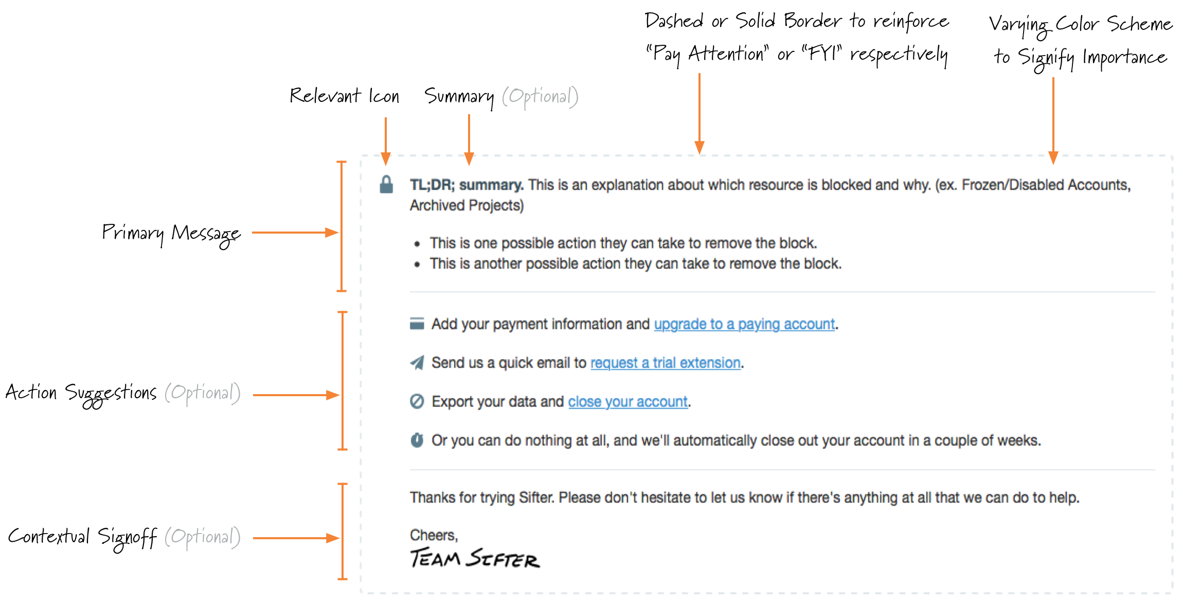
For the visual design, I set aside time to create a simple set of tools to quickly scan all of the different types of alerts. It’s nothing fancy, just a page that hard codes samples of all the alerts. 10 This helps with the style, but not the substance.
Now we can extend or modify our notifications framework and apply the right approach in each situation without fear of rocking the boat. Despite the improvements, this is one of the pieces I’m most excited about because it makes it easier for us to continue to improve.
Too Subtle
Some information was included on the pages, but it wasn’t emphasized. While I’ve always heard and believed that people don’t read the instructions, it becomes much more clear when you receive many emails asking questions that are answered on the page. It becomes a fine line to walk between informing folks and blasting a message at them.
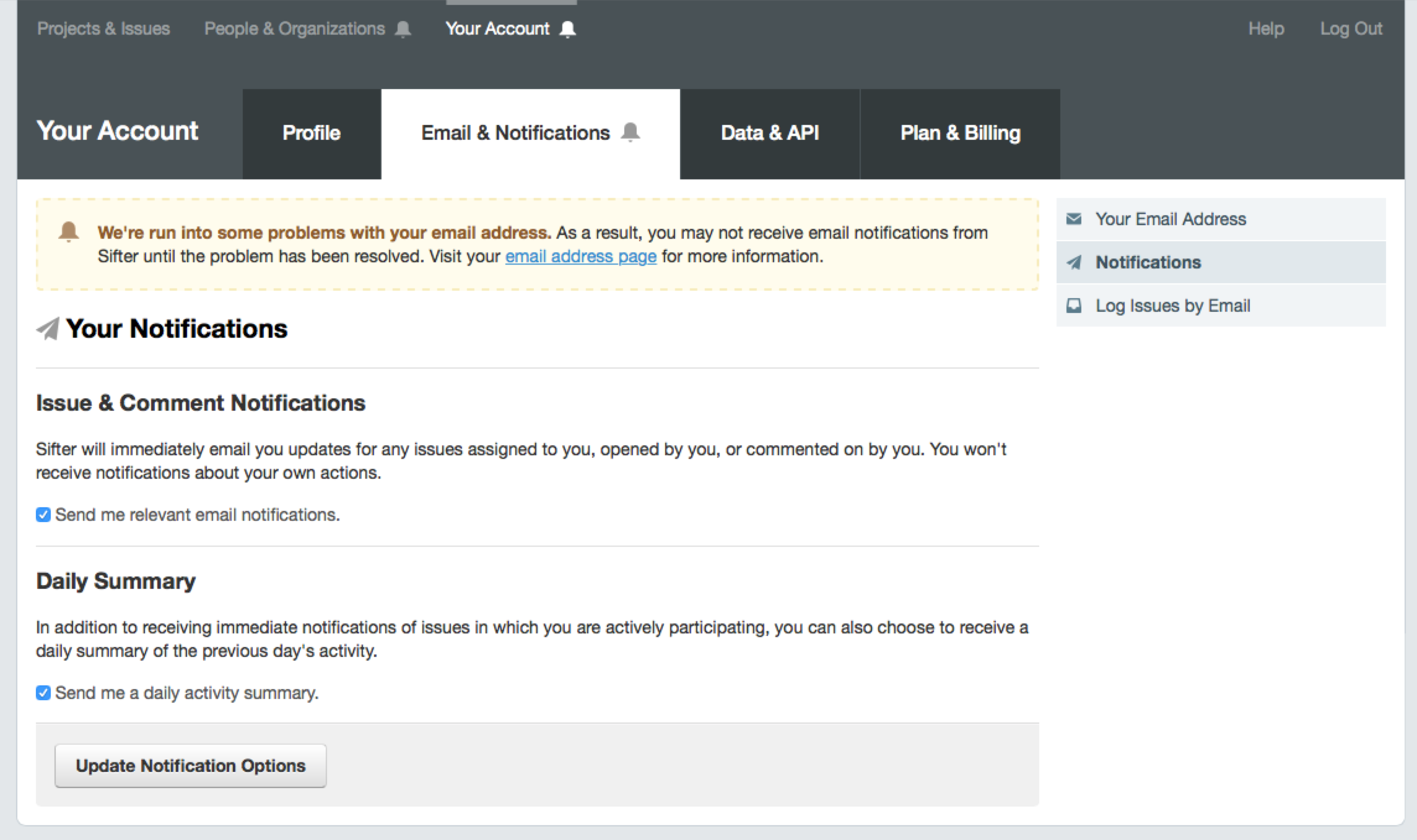
One of the most frequent problems is Sifter’s email integration. Since Sifter is designed to be an internal and private system, our inbound email addresses are tied to user/project combinations. This is how we know who created the issue and what project it should belong to. Despite the emails being private for each user, we frequently receive support requests or catch situations where folks are sharing the emails.
It becomes a fine line to walk between informing folks and blasting a message at them.
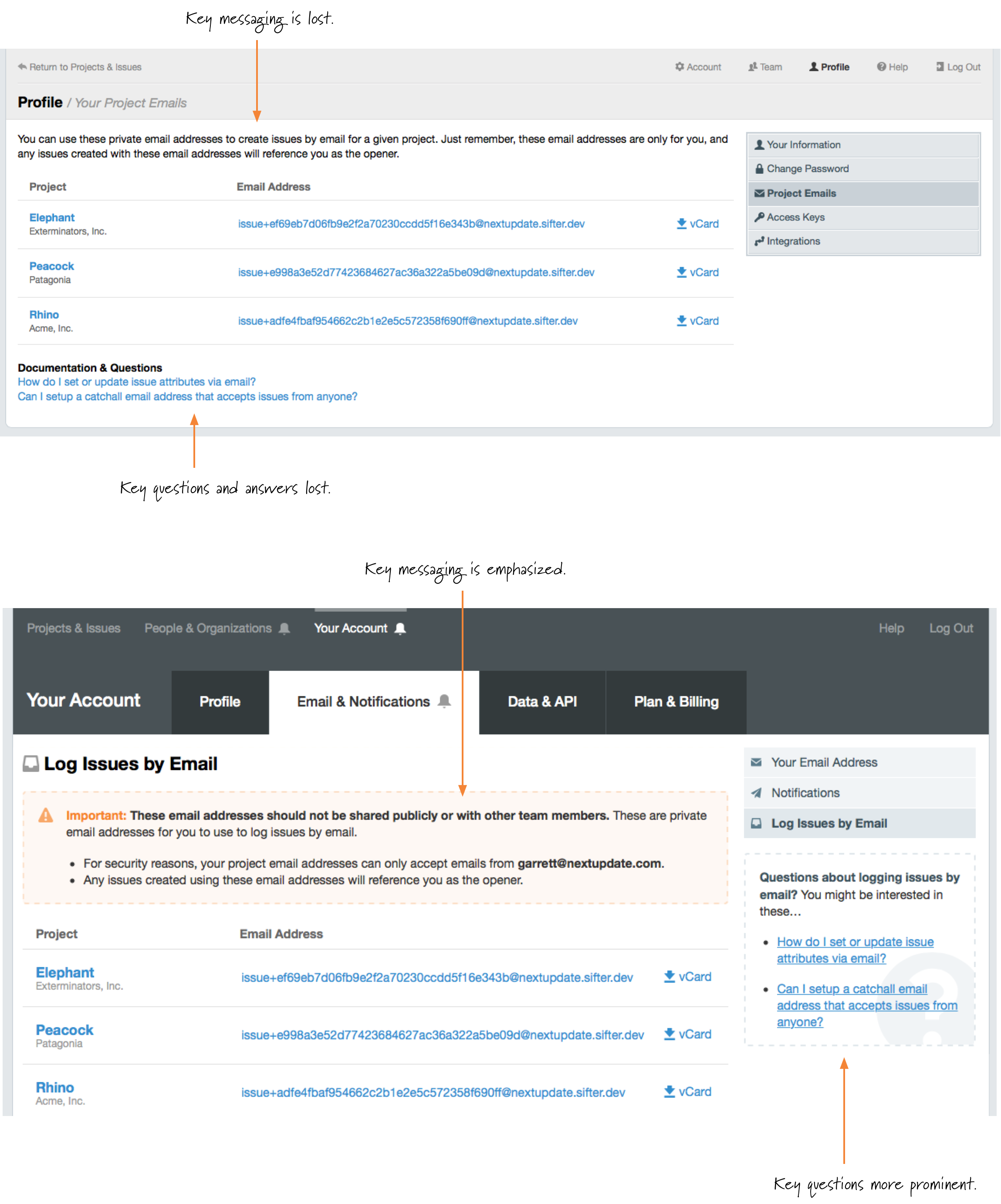
With the earlier approach, we made this information subtle, but based on support requests and failed attempts to create issues by forwarding emails from another address, we had to make a change. 11 With this update, we wanted to visually emphasize the limitations of Sifter’s email integration and provide easy answers to folks looking to understand how it all works. 12
One could easily make the case that the need for some of these types of notifications is the result of a poorly designed feature, and to some degree, that’s valid. In a way, with our long-term plans, the presence of some types of notifications serves as an internal reminder of where we need to improve how the feature works. We have to choose our battles, though.
Too Obtrusive
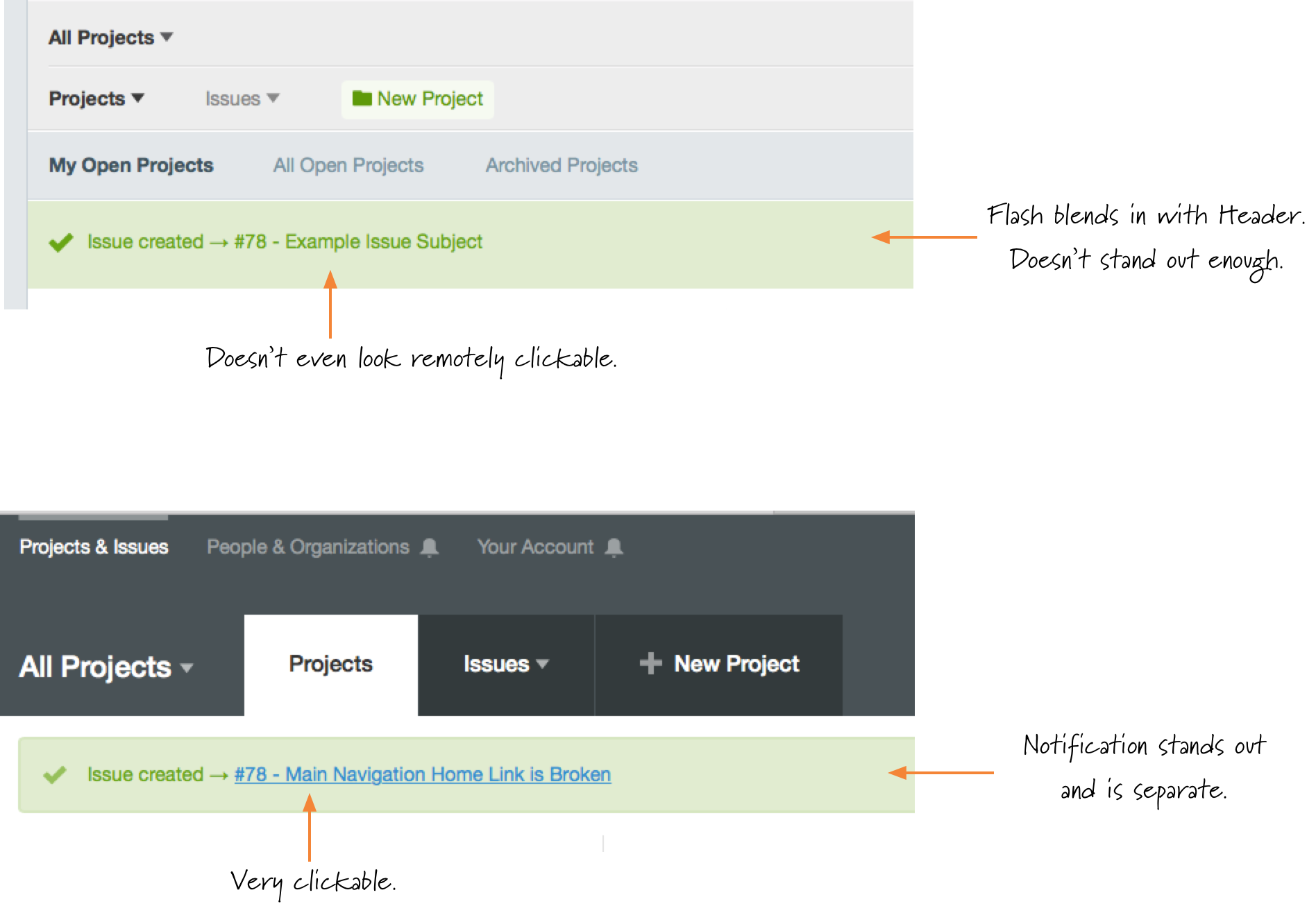
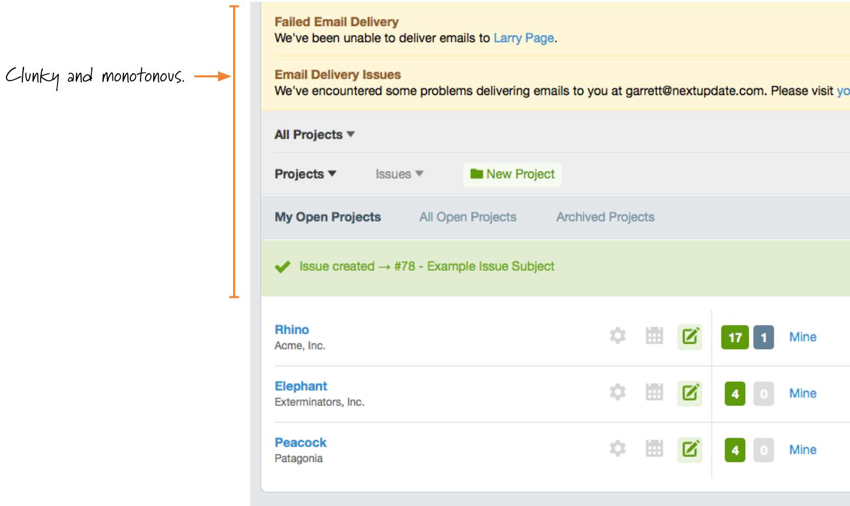
Just as some notifications were too subtle, others were too obtrusive. 13 Previously, most of the notifications and alerts were tied closely to the header, and by “tied closely” I mean “slapped on top of.” There was little intelligence to them and they were sort of crammed in there. This approach was the result of a one-size-fits-all approach to notifications and left a lot to be desired.
With the improved navigation, instead of displaying full alerts, subtle visual cues are used to guide people to areas that need their attention. The improved hierarchy of the new navigation also helps implicitly prioritize notifications so that users aren’t choosing between competing notifications. 14
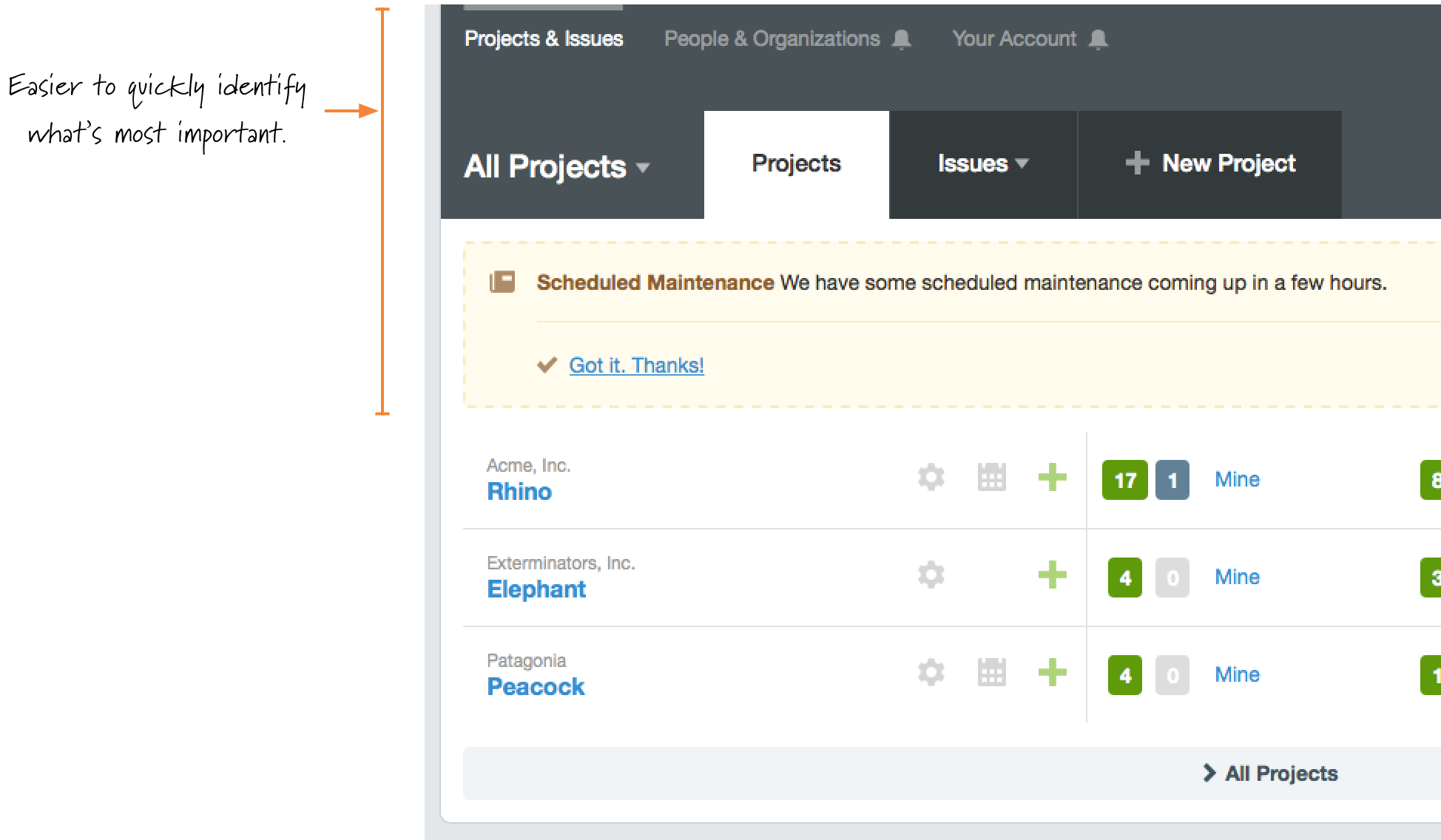
With this header and navigation redesign, the goal was to ensure that the alerts wouldn’t be missed but also wouldn’t get in your way. This way the alerts can be present on every page without getting in the way when you’re in the middle of doing something else. Adding a small icon to the relevant navigation item is a much more effective notification than a set of huge yellow bars. This is a case where aiming for the smallest effective difference works nicely. It’s just different enough to not be missed while being unobtrusive enough that it’s not annoying.
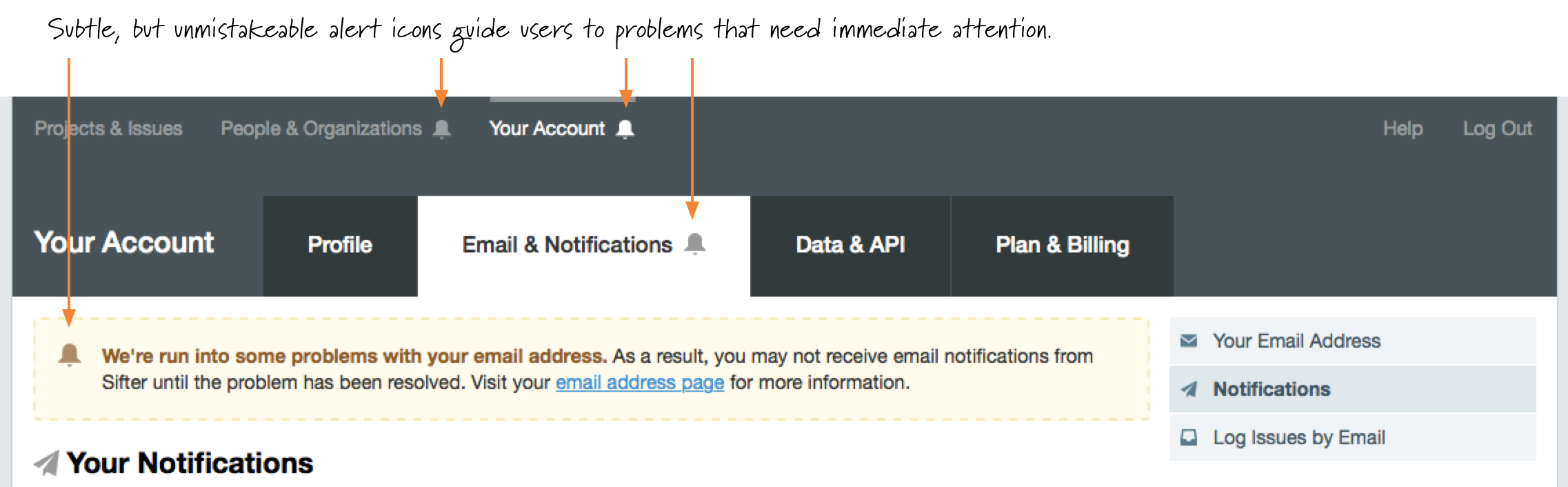
The other big advantage here is that the alerted links are smart enough to take folks directly to the relevant area of the application that needs attention. Once they’re in the right place, we can provide a much more detailed notification. 15 Then, once you’ve navigated to the correct location, the repetition of the icon ties together the relationship between the navigation icons and the notification on the page.16
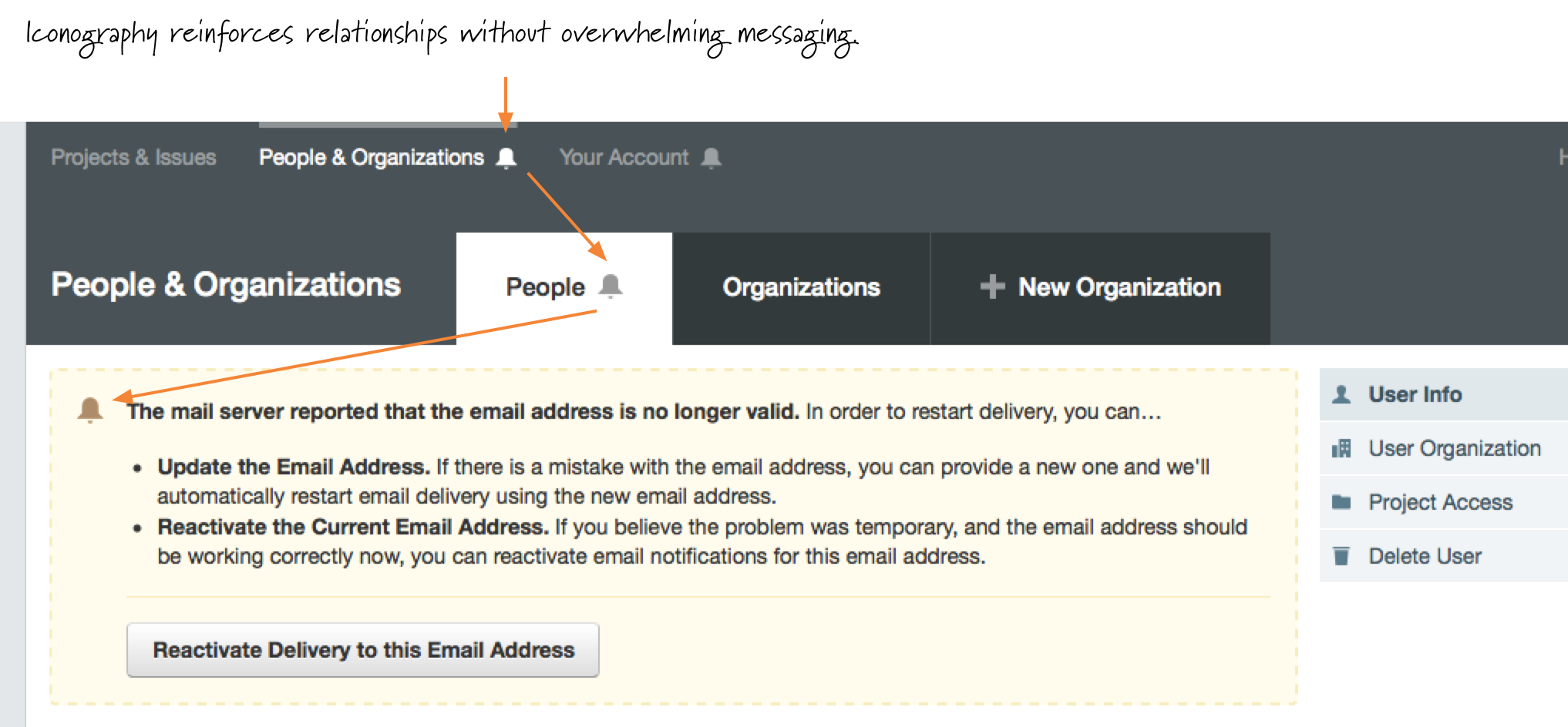
At one point, I explored the idea of having some sort of application inbox for collecting all of the alerts, but it never felt right because the alerts were out of the context of the problems to which they were referring. By using the alert icons, we avoid the extra inbox, link, and area of the application and focus on taking people directly to the problems so that they can fix them.
Bolted On
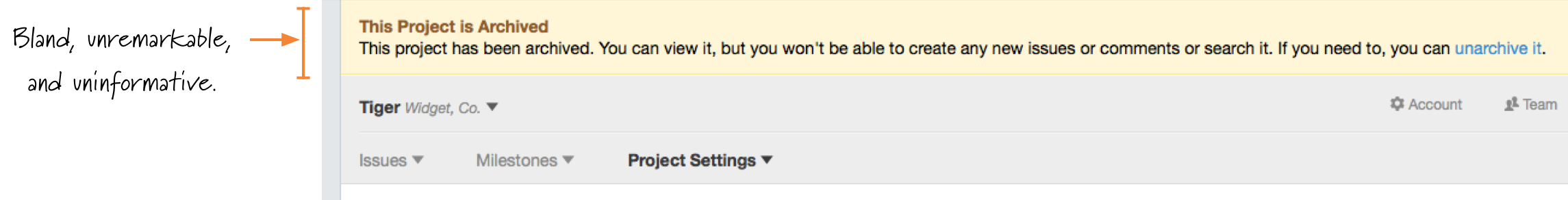
In some cases, the notifications were a sad afterthought for a specific scenario. Our worst offender was archived projects. When a project is archived, it’s still browsable and accessible, but nobody can’t comment or create new issues. With the old header, I just slapped our standard notification on and called it a day. It looked less like a reminder and more like an error. 17
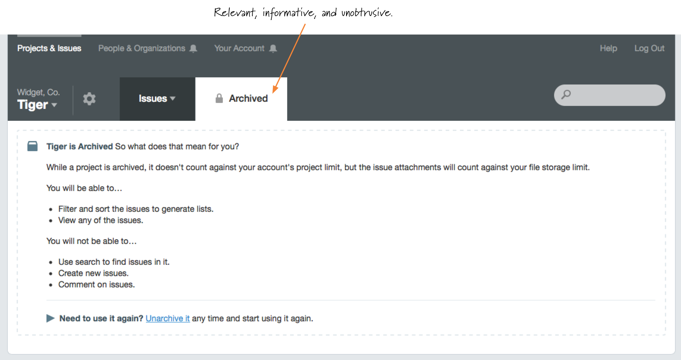
But with this new header, I was able to plan for archived projects from the start. Since the “New Issue” tab isn’t relevant for archived projects, it can be replaced by a more subtle “Archived” tab that can display details about the project and, if you’re an administrator, guide you to unarchiving it. 18
Inconsistent & Inflexible
One of the biggest challenges with the alerts is that they share some key elements but are all unique due to various contexts, target audiences, desired actions, and content. So it becomes difficult to have a consistent framework for alerts and notifications while still maintaining flexibility. The previous approach was “flexible” only inasmuch as they fit into the design. They had been reduced to a bare minimum amount of visual elements, and there was little to no room for meaningful subtlety or variation.
With the new approach, I looked over the variety of notifications that we’d be using and designed a layout that was more flexible so that it could be adapted to different contexts while still feeling familiar to users regardless of where or how we used it. 19 The consistency aspect may sound like designing for design’s sake, but it is the consistency that creates familiarity and helps customers by providing an intuitive interaction model and visual design. Given that many notifications are tied to situations where something went wrong, providing a familiar guiding hand can help decrease anxiety around fixing the problem.
They look better, and they’re easier for people to recognize and act on. It feels like an almost trivial detail, but once you start seeing them in the application and using them regularly, it feels so much easier to interact with.
It’s About Communication
Given their transient and dynamic nature, it’s easy to make notifications a lower priority. They aren’t always there, and they’re easy to forget about. Yet notifications are one of the key means of communicating with the people using software. Spending the extra time to ensure that they’re clear, succinct, and consistent makes software easier to use and understand when things go wrong.