
While exploring ideas for the future of Sifter, we started with the most frequently accessed page on Sifter, the issue listing page. It currently gets the job done, but it leaves a lot to be desired. While we’re not making any promises about what it will ultimately end up looking like, it’s time to begin sharing our vision of where it’s going.
Conceptually, there are two major areas of the page. One is the navigation and structure. The second, and our focus for the near future, is the data. How do you efficiently display the data in a useful and minimal manner? There’s been an incredible amount of iteration, but the common theme has been agonizing over pixels. We wanted to remove any and all unnecessary pixels in order to create a simple and focused interface.
None of this is rocket science. It’s simply a matter of ruthlessly cutting unnecessary pixels. One of favorite principles, and I’m sure the favorite of countless others as well, comes from Edward Tufte. It’s the principle of the smallest effective difference.
Make all visual distinctions as subtle as possible, but still clear and effective.
It’s a recurring theme for me, and one of the simplest and most useful principles that I can think of with regards to information design. WIthout further ado, let’s dig into how we can apply this principle to zebra striping. Our solution might not work in every context, but we think it’s a perfect fit for Sifter.
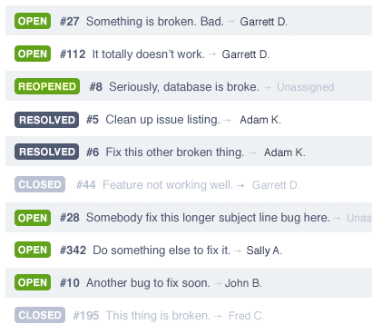
Zebra Striping Version 1
Whether using tables or some other method, it’s important to add a horizontal visual element to assist the scanning of rows. Traditionally, you’ll see zebra striping used to alternate every other row color. In many contexts, that works, but for me, it makes things too busy and certainly requires too many pixels.
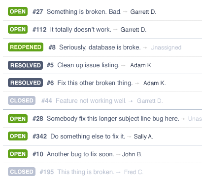
Zebra Striping Version 2
A simpler solution would be to only use a single horizontal line where every other line is a different shade or color.
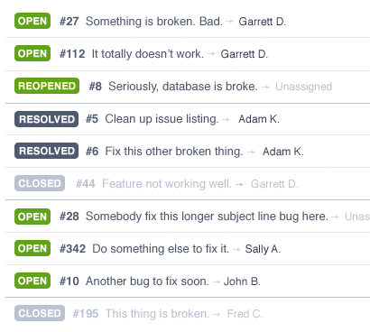
Zebra Striping Version 3
For some, that’s enough of an improvement to stop there, this is just the first step. We could minimize the number of darker rows by only using a dark row every third time. This would still give each adjacent a row a different signature.
- Dark on top and light on bottom.
- Light on top and bottom.
- Light on top and dark on bottom.
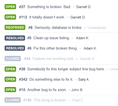
Zebra Striping Version 4
Being obsessive about this kind of thing, though, there’s an even simpler solution that would allow us to remove 60% of the dividers entirely. By simply using a line every 3rd row and skipping the other lines, you have just enough information to assist with the scanning without adding too the visual overhead of row colors.
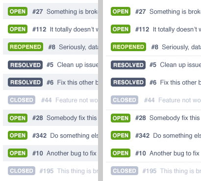
And, for easy comparison, a side-by-side of the before and after.
Summary
Much of design, particularly information design, isn’t complex at all. It’s just a matter of editing your visual elements. Remove things that aren’t necessary. However, it’s important to remember that “necessary” is relative. In some cases, excessive and/or intricate design is necessary to achieve the feeling and emotion you want. The important part is knowing when to say when.