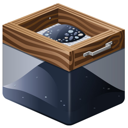
When we set out to create the original icon, we intentionally wanted the style to be something that would work well as a dock icon for a Fluid app, but somewhere along thew ay we forgot to think about the overall shape.

As a result, the icon never felt quite right in the dock. It haunted me, but I wasn’t sure what we’d be able to do. Fortunately, Jared Christensen is a genius and came with numerous workable concepts. We waffled a bit, but pretty quickly settled on the direction that we thought was right for a dock icon. Of course, Jared has provided more detail on the design process over on his site.

The result was something that strays a bit from reality, but we felt the creative freedom was necessary to create something that felt like it belonged on the dock. So, without further ado, download the icon and get going with Fluid. In the future we’ll be adding the proper link elements to the pages so that Fluid will automatically recognize the icon. However, it will be a little while before we do our next release, and I didn’t want to let that hold up sharing it.