
I knew the comment form had to be simple, but I had no idea how challenging it would be to find a simple solution to updating status. For the comment form, status updates were the single most relevant and important facets of the issue. Priority, category, and assignment will change from time to time, but status is what really matters. 1
At the bottom of the comment field, I originally included a status drop down that could easily be switched as the process moved along, but it didn’t efficiently or effectively communicate the purpose and progression of status changes. More importantly, it didn’t really provide a good feeling for what each status change meant. 2

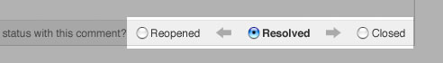
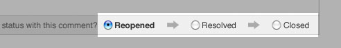
I ended up creating a series of radio buttons linked by arrows to communicate the progression of the status changes. Depending on the current status, the arrangement and wording of the radio button labels changes to help reinforce what each type of update means.
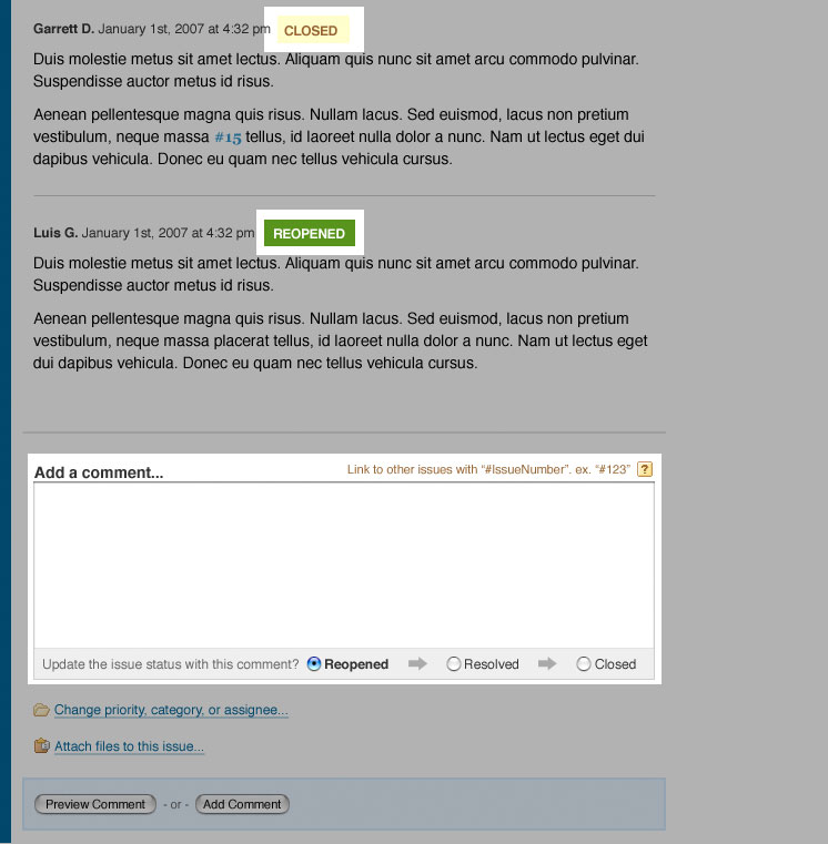
In addition to integrating the status field with the comment form, it was important to be able to quickly understand the history of an issue by scrolling through the comments. This was one of the reasons I also created simple visual flags for quickly communicating status. For each comment that is associated with a status change, I include a flag that corresponds to the new status associated with the comment making it easier to scan and locate specific comments. 2
When the status is open, the ideal progression is clearly visible. 3 First an issue is resolved, and then it can be closed. While I don’t want to encourage that issues ever be changed from open directly to closed, I didn’t want to prevent it in the few situations where it’s relevant. It would have made things unnecessarily complicated in a situations where it’s really the team’s responsibility to use that power with caution. If somebody is abusing that power and it leads to problems, there will be a clear record of who did it, and the project manager can sit down and talk to them about the value of the process.

Once an issue has been marked as resolved or closed, it can never be “open” again. At that point, it can only be “reopened”. It’s a subtle, but important distinction. With my original approach of using a drop down, it didn’t effectively communicate that reopening an issue is a step backwards—sometimes a necessary step backwards, but a step backwards nonetheless. With my radio button and arrow approach, I could simply change the direction of the arrow to help reinforce the options and the meaning of those options. 4 & 6
As I mentioned earlier, once an issue is opened after being resolved or closed, any references to an “open” issue will instead be “reopen”. With the exception of this change, the progression is the same as if the issue were open. 5
Finally, when an issue is closed, it can’t go back only one step to resolved. (Figure 6) It has to start all the way over again with reopened. As a result, we remove the option for resolved and simply use a backwards arrow to indicate the regression when an issue has to be reopened.

If this all seems incredibly simple, and almost childlike, it is. That’s the goal. If I had never gone through the exercise of reducing the issue life-cycle down to its simplest form, I wouldn’t have had a life-cycle that could fit in a reasonable amount of space without confusing anyone and everyone who saw it.
The other convenient benefit is that comments are now clearly associated with the status changes. This helps make the process more natural to include the explanation and the status update in the same stream of consciousness. And, more importantly, it makes it easy to go back and scan the history of an issue to quickly get an understanding of everything that’s happened.