
With the issue tracker, once you are in the context of a particular project, the tabs are organized primarily around responsibility. The three main tabs are “My Issues”, “All Issues”, and “Unassigned Issues”, with “All Issues” implying that those are everyone’s issues. Each tab has a count that communicates how many issues are currently in each tab. Closed issues, which have their own tab, are not included in the counts.

When I initially began design the tabs, I just tacked on a number in parentheses. Since the font was bold, the number and parentheses were bold as well. 1 However, after looking at it for a few days while designing the other pages, the parentheses began to feel obtrusive. They were making it more difficult to quickly scan the tabs and read the counts.
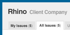
I began experimenting with ways to let the count stand out, first I tried lightening and removing the bold on both the parentheses and the number. That made it difficult to read the number at all. Then I tried varying combinations of color and size until I finally settled on simply toning down the parentheses themselves. The final result is subtle, but a significant improvement over the original. 2
This isn’t a particularly special solution, but it’s one I would have never thought of a year ago. By spending time reading and learning about typography, I’ve learned to pay attention to the details and find a wider range of solutions to any given problem. Hopefully it can help inspire that little idea inside your head when you run into a similar problem.