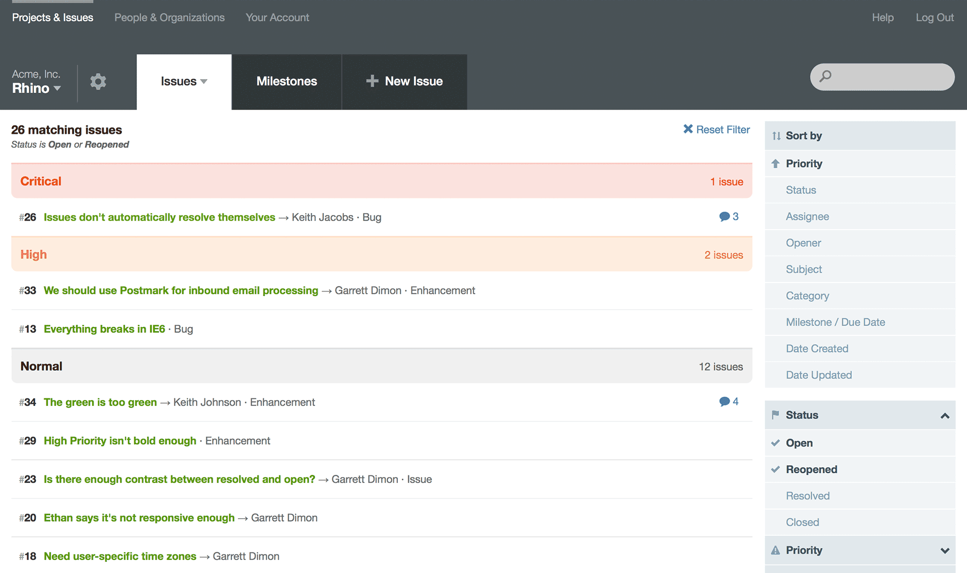
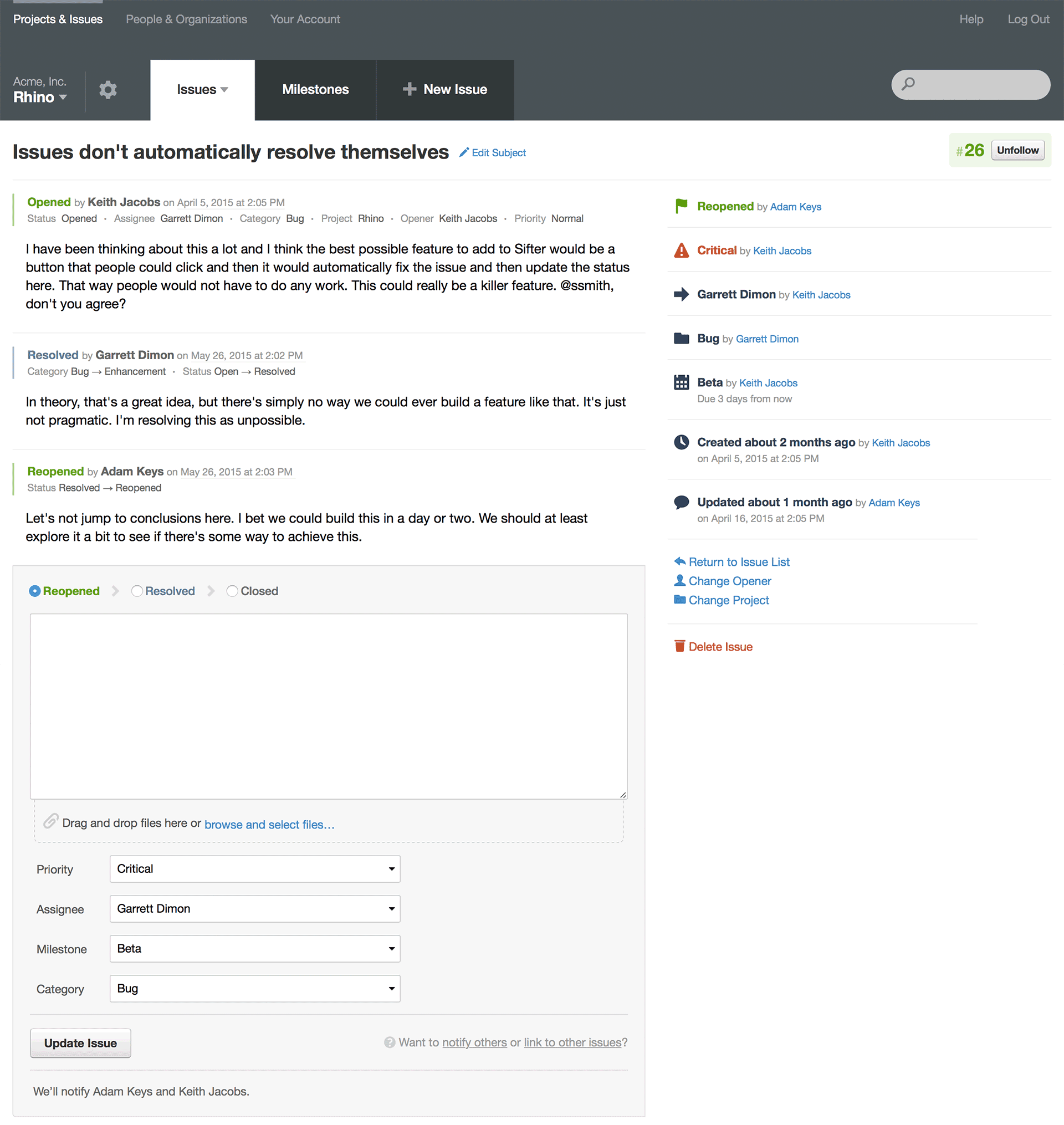
What started off as a minor update balooned into a set of sweeping changes that touched and improved almost every corner of Sifter. While the changes are far reaching, we worked hard to ensure that the changes aren’t so drastic that they affect your workflow. If you’re curious and want to dive into the process and details, we’ve put together a few blog posts covering all of that.

Naturally, with any update this significant, we want to hear your feedback. If anything is out of place, affecting your productivity, or you just have a question, please don’t hesitate to reach out.

Let’s Talk Mobile
In addition to the afore-mentioned big changes, we’re also updating our approach to mobile devices. Previously, we relied on responsive techniques to adapt the desktop pages to work a little better on mobile devices, but this was always a stop-gap as it started with our desktop pages and bolted on changes for mobile.
Long-term, we’re working towards dedicated mobile views that are optimized to be lighter and faster for when you’re accessing Sifter on the go. The first steps towards this goal happened in this release. While not every page has been migrated to mobile, we’ve chosen the key pages and updated them for a better experience. The entire app is still accessible and available, but you might need to pinch-to-zoom here and there. Over-time, we’ll continue to migrate the more popular pages and optimize them for mobile.
Share Your Thoughts
This release kept us much busier than we originally anticipated, but we’re really excited about it and think it will make a world of difference in your daily use. That said, we don’t want you to settle for good enough. If you have any feedback at all, we’d love to hear it. Customer feedback and support requests directly and indirectly played a huge role in shaping the improvements that we’ve put into this release, but that doesn’t mean we can’t make it even better. Just send us an email and let us know what’s on your mind.