
This release started out as a handful of minor updates so that we could accommodate some other updates to notifications like @mentions and the ability to subscribe/unsubscribe to a single issue. With both, we needed to make some modifications so that we could design and build this new stuff. Of course, it doesn’t hurt that the necessary modifications are a significant improvement in their own ways.
The Issue Detail Page
The old issue detail page had two huge problems. The first was that there was no visual distinction on the page for any attributes other than the status. The subject was too small. The status bar was too busy. It had just all gotten a bit cluttered over time. The second major problem was that we had run out of real estate. The original design wasn’t very efficient with space because it didn’t need to be with the original feature set. With some new features, though, we need that real estate.
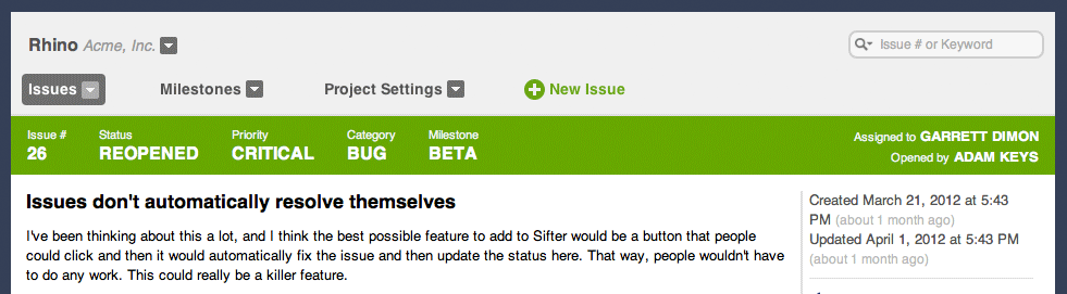
The first, and most noticeable change is that the status bar is now much simpler and only includes the issue number, subject, and status. The milestone, priority, category, assignee, and other attributes have all migrated to the sidebar. The added bonus here is that the attributes change color based on their importance. For instance, if an issue is overdue, the due date (from the milestone) will be displayed in red. The priority color changes based on the priority. And, when an issue is unassigned, the assignee will be red as well.
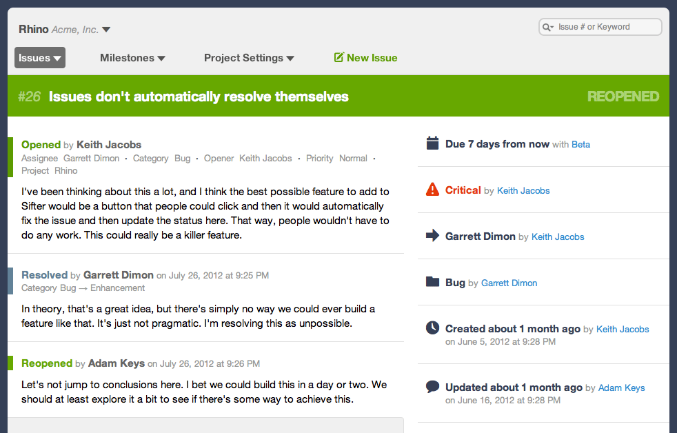
I posted some of the original mockups for this feature on Dribbble almost two years ago. It’s been a long time coming, but we’re finally able to start realizing some of the vision for Sifter. Expect to see a lot more of these kind of improvements in the near future.
HTML Email Notifications
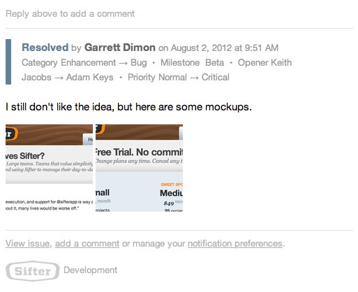
With more advanced email and notification functionality, plain text emails simply weren’t going to cut it. We had to design emails that made it easier to see and work from the emails. So now, all of our emails are easier to scan, offer more relevant options and links, and are generally more pleasant. We’ll still be iterating on them, but these updates are truly much more significant than they might appear on the surface.
Packing functionality into an email is a tricky matter, but we have some rather ambitious plans to make Sifter’s notifications both more enjoyable and more useful. This opens that door for us. By the way, if you need to test HTML emails, we highly recommend Litmus.
Forms, Visual Design, Consistency, and Simplicity
Sifter has long been about simplicity, but we’ve never quite been as ruthless about it as we would have liked. This release continues moving us towards trimming some of the fat. Instead of graphic icons, we’re now using flat font icons. While we’re not completely there in terms of touch interactions, Sifter’s starting to look pretty good on those retina displays.
We’ve polished off a few rough edges, enlarged the typography a bit, and generally tried to make the experience more consistent throughout. We’ve also updated all of our web forms so that they’re more visually consistent across browsers as well as making buttons a little larger and a lot easier to click.
Summary
On the surface, this feels like an almost trivial and superficial release, but rest assured it’s much bigger than that. In terms of updated code, this is the second largest update in the last year or so. More importantly, it’s the final step before we start on some admittedly long overdue features. We hope you enjoy!