
Many people falsely assume that interface design can mask any ugly complexities of the underlying business. Others don’t even think about it because they can’t change it. In either case, we need to be doing more. In my experience, this is an ongoing educational process that is often more difficult than designing the interface. You can put lipstick on a pig, but at the end of the day, it’s still a pig.
Recently, I came across an example of this in my work on the issue tracker. I invested a significant amount of thought upfront and made some tough decisions to scale back the issue tracking process. I didn’t realize it at the time, but I was inspiring what would ultimately become the interface for managing issue status.
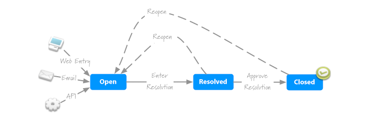
I was stumbling through a variety of ideas on how to let people seamlessly update issue status with comments. The effort was actually going pretty poorly until I was looking at my underlying process for tracking issues. (Figure 1) I saw the process and quickly realized that, with a few radio buttons, the interface could work just like the process looks.

Affordance
One of the reasons I’m so excited about this little aspect is the level of affordance it provides. It’s design and form imply its purpose. It doesn’t simply communicate the status. Instead it communicates where that issue is in the process. 2 The interface actually helps to explain what the underlying process is. The simplicity of the two go hand-in-hand. Also, the representations of the elements can change depending on the status to help communicate the relative impact of decisions.
Implementation
Of course it looks nice, but can it be done? The answer there is easy. A list or fieldset could easily group the elements for both accessibility and good clean semantic markup. Then, with a sprinkle of CSS, the arrows can be added in as background images, and before you know it, we have a simple and elegant solution to what could otherwise be a pretty ugly problem.
Summary
It’s easy to take these kind of decisions for granted, but in reality, I would have never been able to create such a concise and effective interface if the process was any longer than it is. Even a fourth step in the process would have led to a prohibitively long list of choices.
The moral of the story is that while we may have control over the interface, it’s often more valuable to take a hard look at the underlying process. Of course, that kind of effort can get into politics and be incredibly difficult, but much of the time, it’s actually the right solution.