We’re about to release what has turned into arguably one of the largest releases we’ve done since launching Sifter. The primary focus has been making Sifter easier to use and navigate, but some more subtle changes also make it much more pleasant. One such change has been tidying up sorting and filtering. 1
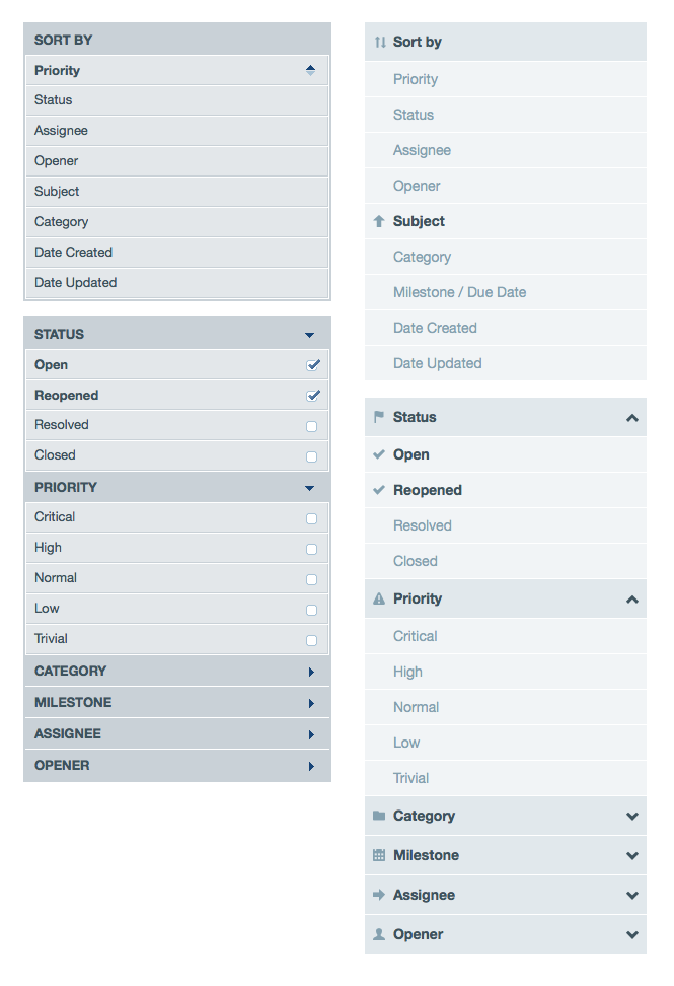
While it’s clear that the newer version is different, it’s also still very familiar. The changes, however, were driven by more than just adding a fresh coat of paint. So let’s dive in and explore some of the details and decisions behind the changes.
Group Headings & Icons
Icons can be a blessing or a curse. When used indiscriminately or without accompanying text, they can hurt recognition, but when used sparingly in conjunction with good labels, they can help differentiate and increase speed of recognition.
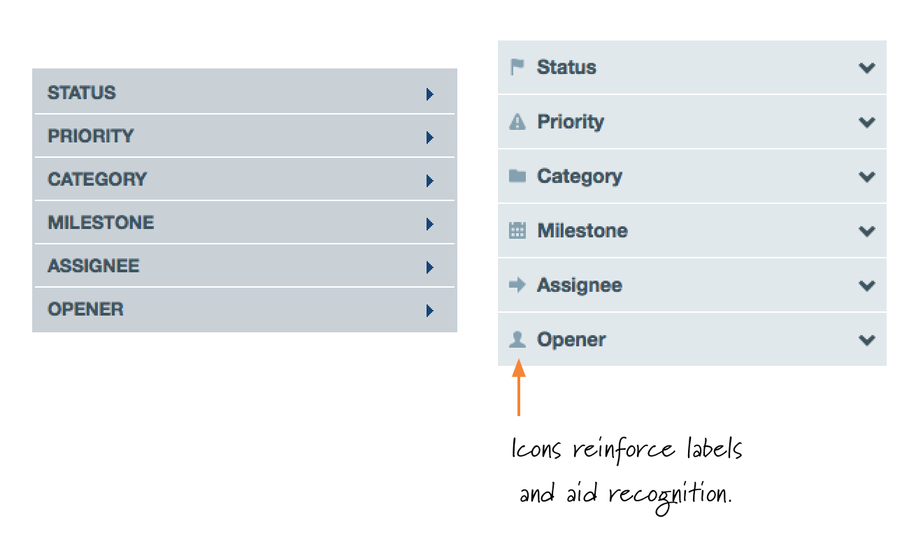
With the issue filters, there’s a lot of similarity between the group labels. They’re always in the same order, but the list can vary from project-to-project or when viewing all projects. Adding icons makes it that much easier to tell them apart, and they align much more nicely with the filter options. 2 The addition of the icons to the group headings also paves the way nicely for left-aligning the icons for each filter and sort option. 3
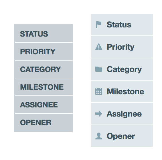
While icons help differentiate the headings to some degree, another problem was that they were all uppercase. Not only was this clunky, but uppercase letters, especially at small sizes, are a little more difficult to read. 4 So now the headings use mixed-case in conjunction with the complimentary icon, and they’re much easier to read and scan.
Selected or Deselected?
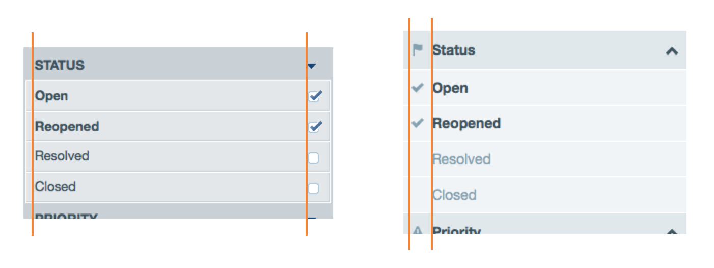
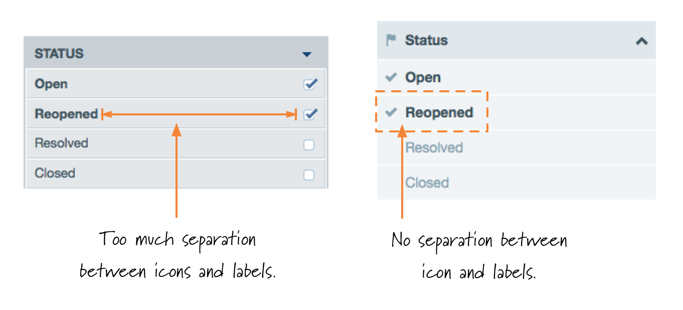
One subtly insidious problem with the previous filter selected states was that the icon representing selected/deselected was right-aligned while the text was left-aligned. 5 This left a significant visual gap that made it more difficult to see which icon was associated with which text. By placing the icon to the left of the text, each filter option is more of a self-contained selected/deselected state.
We also needed to improve contrast with the selected and deselected states for each option. So with the new filters, we only show an icon when an item is selected. The lack of an icon when a filter isn’t selected increases the contrast between selected and deselected items. We also faded the color of the text a little for the deselected state. (This contrast may turn out to be too low, but we can adjust it if we need too.) 6
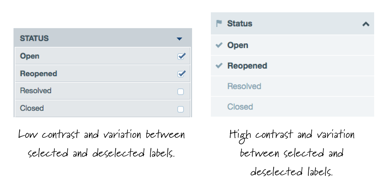
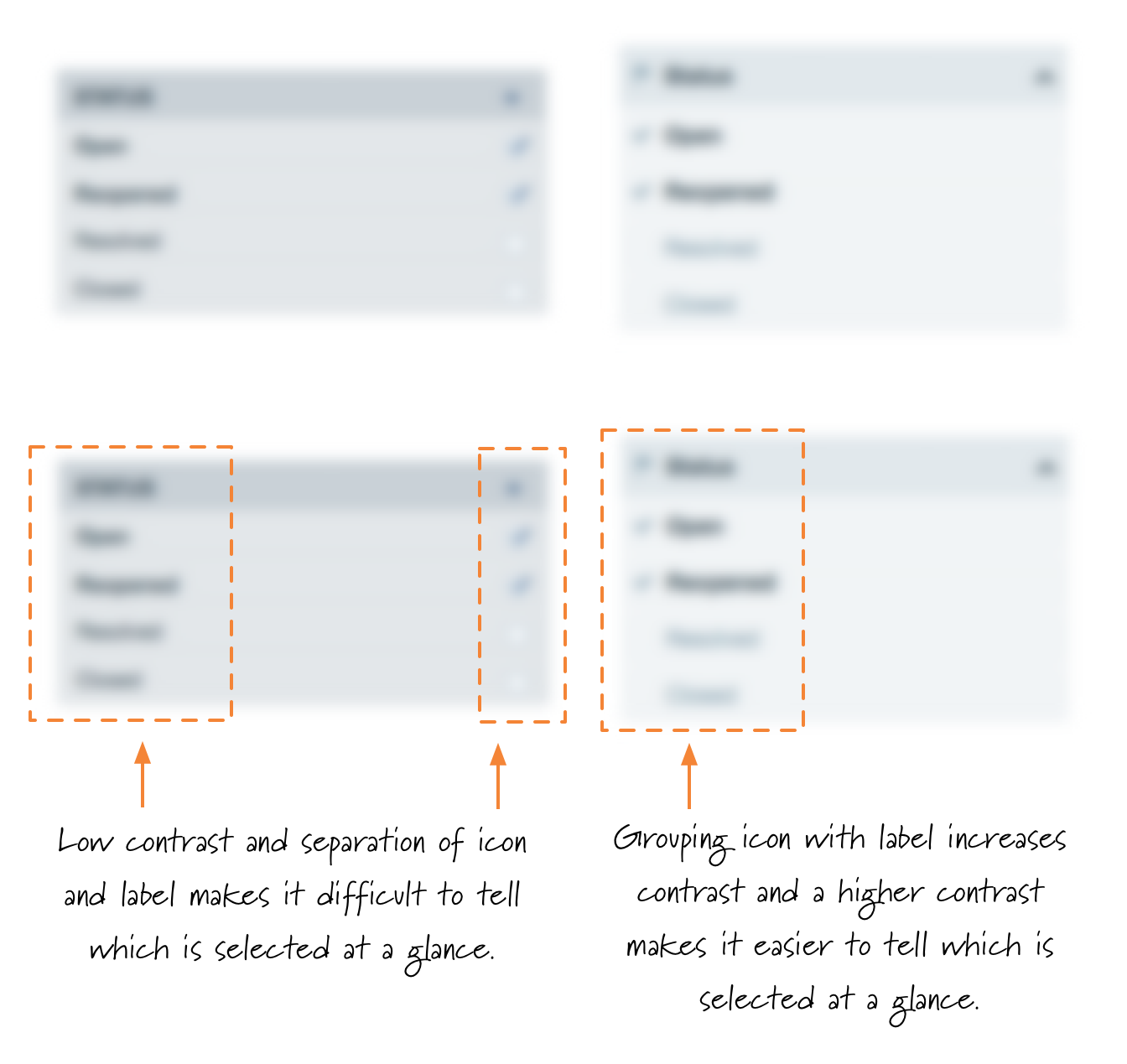
Each of these changes by itself isn’t dramatic, but when you put them together, it makes a world of difference in the visibility and ease of recognition. A great way to illustrate this is by looking at it through a bit of a blur. When you do, it’s difficult to discern the selected options from the deselected options without looking at the icons. (And remember, those icons weren’t in close visual proximity to the label.) With the new version, though, it’s very clear which items are selected and which aren’t. 7
Better Hover States
Another key change was with the hover state for the filters. Previously, the hover state made the background a little darker and swapped out the icon. (The one that was all the way to the right of the text.) While this worked, it was a little clunky. 8
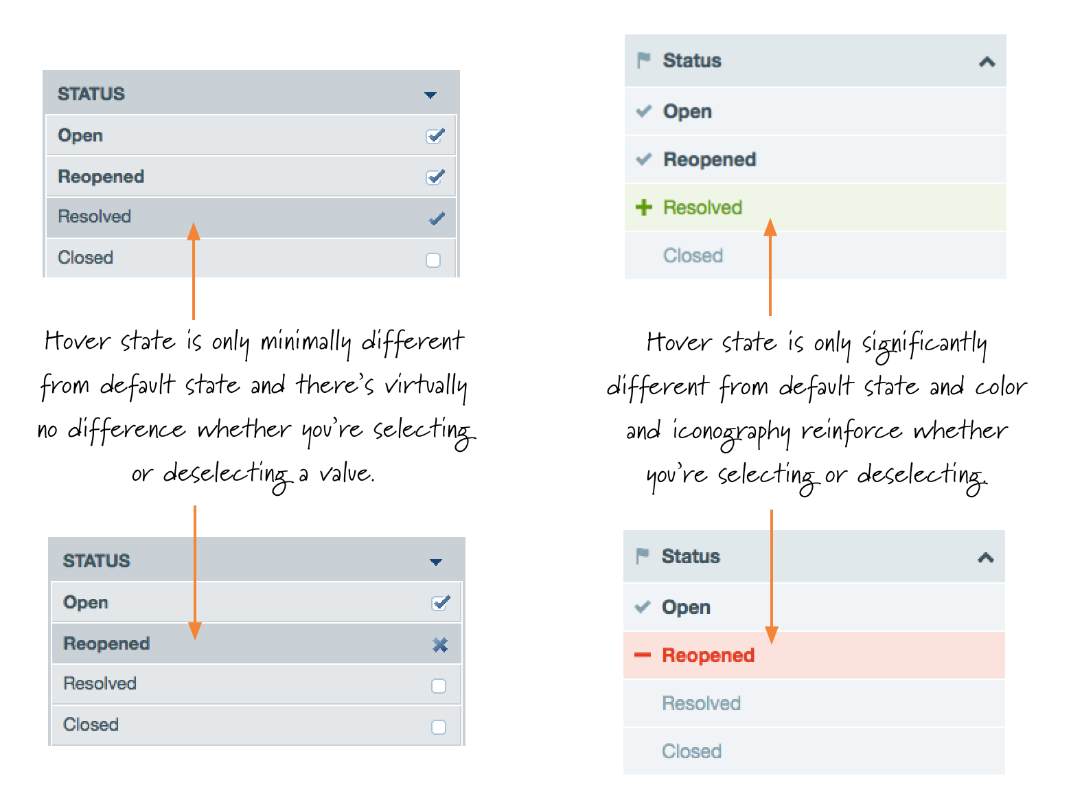
With the new approach, we don’t simply make the background darker, but we use a different color to represent addition (green) or subtraction (red) in conjunction with a larger change to the icon which is now visually closer to the relevant filter option. It’s now much clearer what will happen when you change your filters.
Cleaner & Simpler
In addition to making it easier to use, the filtering needed to be less busy, and ideally, narrower. So I set out to trim the unnecessary bits and lighten it up.
I started with the background color and lightened it up. This increased the text contrast, improved readability, and gave me the opportunity to lighten the text for the deselected states and still maintain contrast with the background. This helped further differentiate selected and deselected states. 9
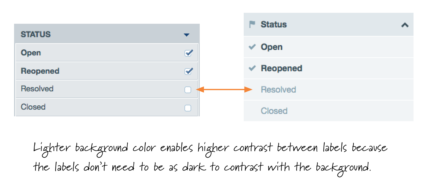
I also removed the outside border and simplified the visual divisions between the selected elements. This gave each item a little more breathing room and a few more pixels for larger fonts. 10 This is primarily an aesthetic change, but it’s one of those little adjustments where removing an unnecessary visual element backs up the idea that less is often more.
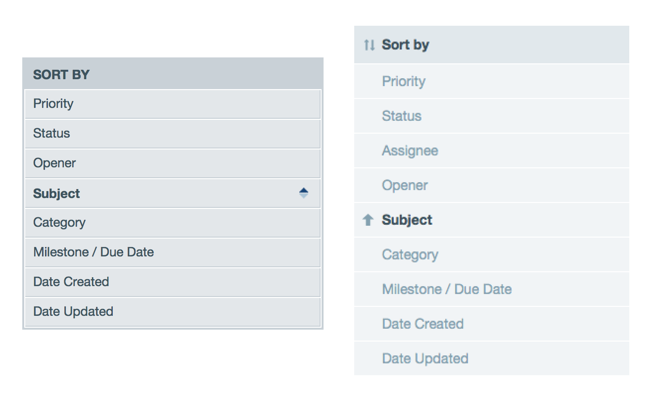
Another minor detail that never sat well with me was the tiny size of the sort direction arrows. They worked, but they felt too microscopic. So I replaced them with larger arrows. 11 They’re now more readily visible and obvious whether something is sorted ascending or descending.

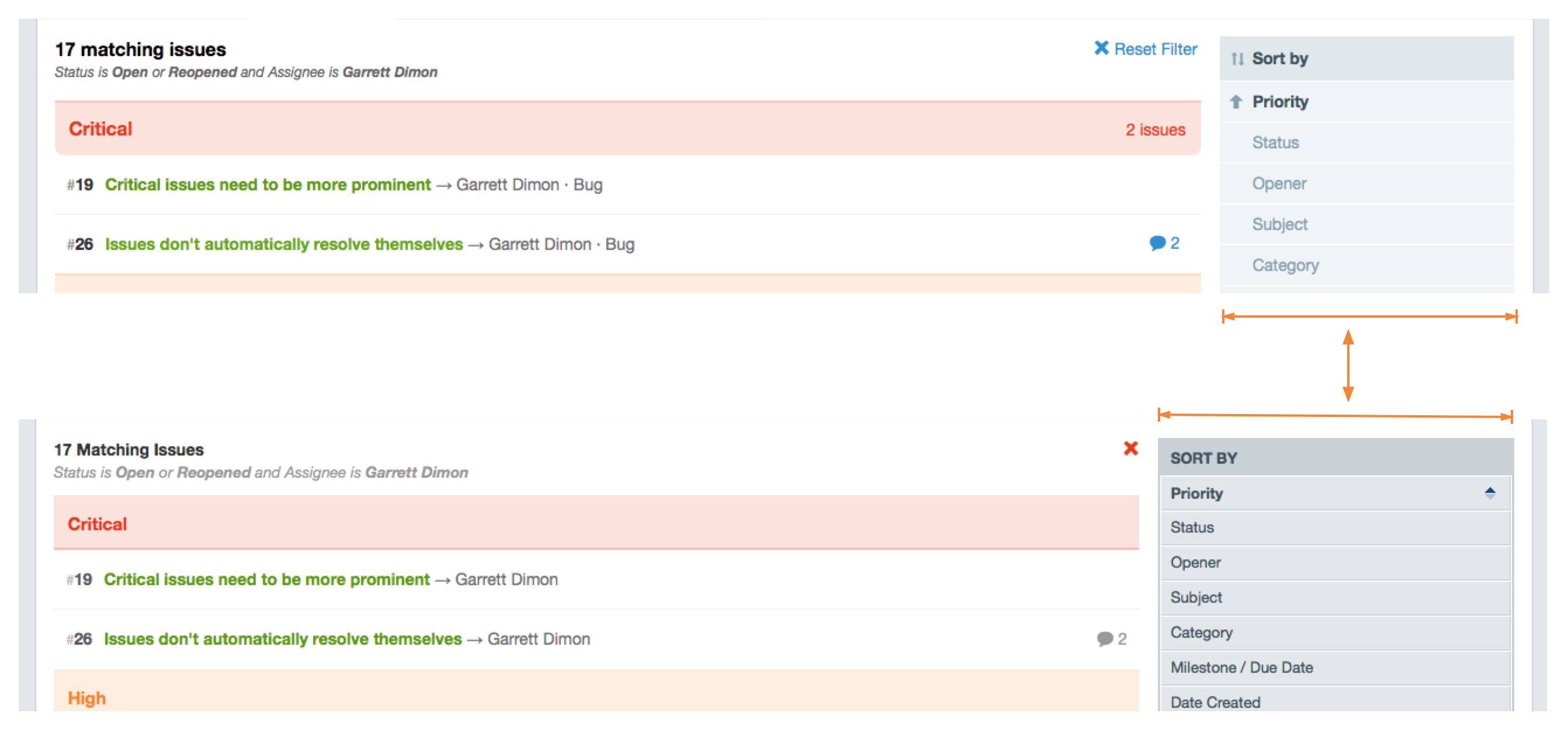
Finally, an almost imperceptible change is that the filter column is narrower now. Since the issue listing is the primary content, it’s important to have as much horizontal space as possible to prevent wrapping. So the filters are just a little narrower to accommodate the more important content. 12
The Devil is in the Details
In the larger context of this upcoming release, these changes are minor, but once you start using it on a regular basis, all of these details add up to a much more pleasant experience. They’re the kind of details that I didn’t take time to polish up in the past, but now that I’m setting aside time to smooth these kind of rough edges, Sifter is significantly more fun to use. We think you’ll like the changes too.
If you liked this peek behind the curtains and haven’t read the other two articles about the changes to navigation and notifications, you might enjoy them as well.