Just in case you missed it, Sifter launched last week. With all of the new material, I wanted to get back to sharing some of the behind the scenes details about designing Sifter.
Today, I wanted to focus on a feature that exists almost entirely behind the scenes. It’s more about interaction design than tangible aspects like visual or interface design, but it’s just as relevant to creating a good user experience. Just because a feature isn’t visible, doesn’t mean that it’s not valuable.
The Feature
I have been calling the feature “Smart Return”. The idea is simple. Whenever you’re viewing a list of issues, it’s possible, and likely, that you’ve sorted it a certain way or filtered the page so that you only see the issues that you care about right now.
The problem is that when you leave the page to create an issue or update an issue, we need to make sure return you to the page you originally came from as well as remember the state of the page so you don’t have to reapply your sort and filters.
A Real World Example
For instance, let’s say that I have a dozen issues that are assigned to me. Of those, I decide to focus exclusively on the critical and high priority issues. Since the list is short, I go ahead and sort them by when they were created. That way, I can make sure to address the oldest issues first. So, at this point, my page is filtered and sorted on several different parameters. (Figure 1)
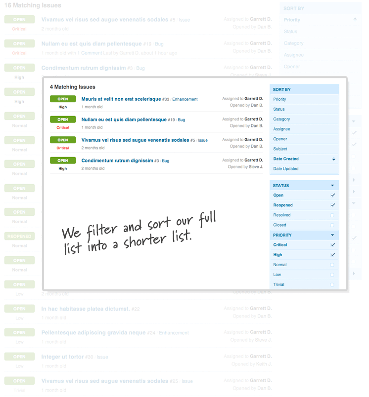
Now, when I click on an issue, I’m taken to the issue details page. After I take some action on this issue, it would be annoying to have to sort and filter my issue list every time. So, regardless of what I do next, I’d ultimately like to return to my issue listing sorted and filtered the way that I left it. (Figure 2) On the surface, this seems like an almost trivial problem. Capture the referrer, and send you back there after you’re done. Unfortunately, it wasn’t that simple.
The Curveballs
No Sessions
The initial idea for all of this was to simply capture the value in the session and hold on to it until we were ready to use it. Unfortunately, we’d need to clear that session variable whenever we finally did use the value. Otherwise, the return value could very easily be incorrect if you follow a different course of action and we didn’t reset it. This seemingly small limitation led to a much more advanced, but ultimately elegant solution.

Entry and Exit Points
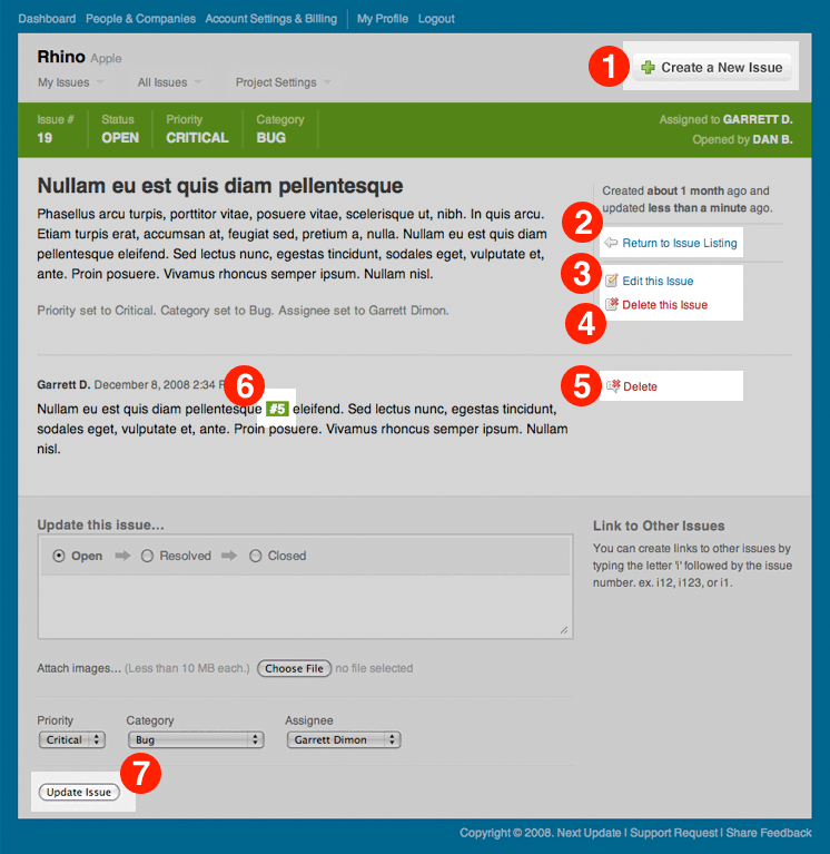
From the issue detail page, there are actually multiple different actions you could pursue, and each complicates matters in its own unique way. Without going into the boring detail, there are 7 relevant courses of action that we need to consider. (Figure 3)
- Create a New Issue – It gets really hairy here because you can ultimately end up creating and adding another issue countless times, and we need to constantly keep track of your issue listing and sorting conditions.
- Return to Issue Listing – While this is conceptually simple, it presents a challenge in that it’s possible to arrive on the issue listing from the Dashboard. As a result “Return to Issue Listing” isn’t always accurate, and we need to dynamically check and see if the text should be “Return to Dashboard”.
- Edit the Issue – Editing the issue takes you to a different page, so we end up losing the value of our referrer. As a result, we have to make sure that we pass the referrer along to the edit page so that it knows where to send you after you’re finished editing.
- Delete the Issue – This is fairly straightforward. We need to delete the issue and send you back to your list.
- Delete a Comment – Thankfully, this is handled in almost exactly the same way as deleting the issue.
- Follow a link to a different issue – Of course, issues can link to each other, so it’s entirely possible that you might go off and look at another issue. If you do, we still need to be able to bring you back to your list.
- Update the Issue/Add a Comment – This is similar to deleting the issue, however, because we’re using a web form, we have to remember the URI with a hidden form field instead of passing it in the address bar.
Minimizing the Use of the Querystring
A small, but very subtle point is that we need to do all of this while relying on the query string as little as possible. Many people copy the issue link and paste it into their commit messages for source control. 4 If a query string value is used to remember the original starting point, then the link becomes cumbersome to use in a commit message.

We weren’t able to do all of this without leaning on the query string a little, but we definitely made a conscious effort to rely on it as little as possible. This definitely presented some small issues that weren’t trivial to work around.
In some cases, this may seem trivial, but it’s a crucial part of the interface design. Being able to access and share issues by copying and pasting links is going to happen. In fact, it’s going to happen a lot. So that means that clean URLs, while not always possible, are a high priority.

Similarly, all of the issue listing pages are handled within the query string (Figure 5) so that they can easily be shared with other team members or bookmarked in your browser.
Missing Referrers
Finally, while we initially grab the referrer from the environment, there’s no guarantee that we’ll have a referrer. If you visit a link directly, we have to fall back on a default. So, we had to be able to specify default locations to send you if you arrived from an external link.

Designing the Solution
Now that we have a firm grasp of the problem, we can dive into the steps we took to design a solution. This solution is actually the second version of “Smart Return”. The first version evolved over time as we began to recognize the edge cases, and as a result, it had plenty of room for improvement. With this version, we were able to design the solution from the ground up after we had an intimate understanding of the problem, and that was key to creating a cleaner and more maintainable solution for the future.
Recognizing a Pattern
This time around, I wanted to build a reusable framework that would be easy to understand and reuse throughout Sifter. So, I went through the page flows so that I could build an understanding of the entire scenario.
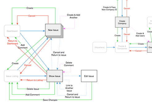
I started off with some quick sketches (Figure 6) of the page flows. Then, I migrated the sketches into Omnigraffle (Figure 7) for a more detailed view of the concepts and challenges.
Designing a Framework
At this point, I began to understand and see how the different pages interacted with each other. I made sure to cover all of the different scenarios and set out to describe how each page would share the return URL with the other pages. 8
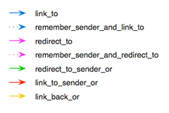
This laid out the vision of how these pages would work together, and I had a language to describe the relationships. At this point, it became almost trivial to implement the code necessary for making it happen. More importantly, it became incredibly easy to apply this logic at other points within Sifter.
Summary
One of the most significant pieces of creating a web application is understanding the interaction design. This almost invisible, yet critical piece of the design process is easily overlooked. If done correctly, it’s invisible and taken for granted. However, if handled poorly, it’s the difference between a clunky vs. a seamless experience. Long story short, some of the most valuable elements of design are the ones that you don’t see. Just because there isn’t a visible manifestation of a decision doesn’t mean that it’s any less important.