
Before we begin, it’s important to note that there’s a fine line between continual evolutionary change and aimless wandering. That point is likely different for everyone, but I’ve found that evolutionary change to be more purpose-driven and aimless wandering to be more, well, aimless. It’s not something that’s easy to nail down, but being on the lookout for it can definitely help save you from wasting time.
Sketching & Drawing
While our tools continue to get more powerful and intuitive, I have yet to find a tool that beats pen and paper in the early concept phases. It’s fast, temporary, and it feels more casual and relaxed than keyboard and mouse-based tools. I’m sharing a couple of small sketches here, but for every sketch here, there were a dozen more variations on the theme where I explored the different concepts. The ones here were the “winners” in a manner of speaking and are more closely aligned to showing how things evolved.
In this first example (Figure 1), the most notable aspect is my lack of concern for the precise navigational labels. I knew there would be some sort of navigational structure, but at this point, the labels just didn’t matter. By ignoring that aspect, it let me focus more exhaustively on the other bits of information and their relationships with each other. This sketch became the foundation on which the header began to evolve.
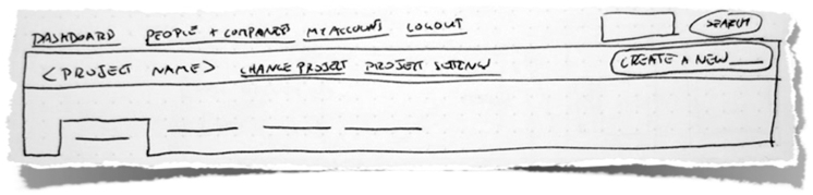
With the next sketch (Figure 2), I began to give more thought to the labels and the visual weight of the different areas. It’s still very similar to the previous sketch, but became more of a stepping stone to validate my decision and help me determine if it would really work.
At this point in the process, I’m generally at a point where I’m moderately comfortable with the ideas I’ve sketched. I feel like I’m heading in the right direction, but I still really have no idea where I’m going or where I even want to go. It seems silly to talk about it that way, but at each step of the proc4ess, I move on at a point where I’m just barely satisfied with what I’ve done to that point.
Information Design
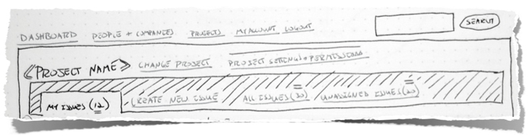
There are many aspects of design, but for me, information design is one of the most interesting. At this point (Figure 3), I’m essentially wireframing, or creating higher fidelity versions of my sketches. I intentionally ignore color, and instead focus on using shades of grey. By ignoring color, I’m removing a variable so I can focus on the real underlying relationships between the information and navigation displayed on the screen. It’s liberating and constraining at the same time, but most importantly, it just works for me.
Once I’ve placed all of the elements on the page, labeled, and arranged everything to the point that I’m just barely comfortable again, I start thinking about color, typography, and other aspects of visual design. It’s also worth noting that this is the first point where I start thinking in the back of my mind how the code might end up working itself out.
Visual Design
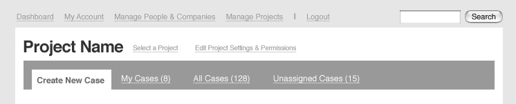
The changes in this phase (Figure 4) appear marginally superficial at first glance, but they really run deeper. The most significant adjustment here is that I realized the primary action of creating new issues was obscured in the layout I had created because it was “just another tab”. As a result, I decided to give it a bit more visual prominence and remove it from the tabs. At the same time, I decided the links next to the project name where more distracting than beneficial, and moved them accordingly.
After those adjustments, I reached a point where I wasn’t completely satisfied, but I knew it was good enough. I took what I had and begin building the app. All of the design time in the world wouldn’t matter if I didn’t start building it. So I tore into the markup and built about half of the app before realizing something just wasn’t right.
Mid-course Adjustments
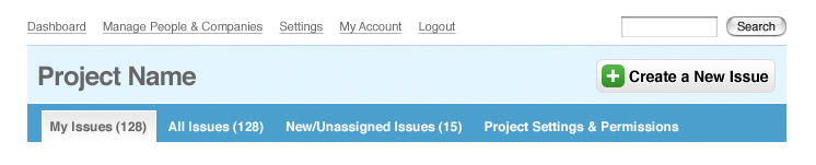
After spending some significant time coding and interacting with the app, I had enough context and time away from designing that I was able to objectively reevaluate the design and make some improvements. The basic concepts and information didn’t change, but the visual design changed dramatically. Initially, the header was sort of free-floating and then sub-divided into a top and bottom half. It felt fragmented and disconnected.
I went back into design mode to make some necessary tweaks. I merged the top and bottom halves and adjusted the colors to make it support the page instead of dominate it. I also made some changes to “frame” the body of the page with a solid background color to help visually contain everything. (Figure 5)
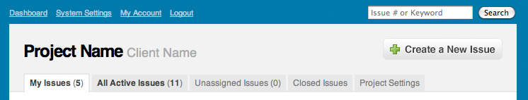
As I was back in design mode, I was able to spend some time rethinking the purpose of the header on some of the other pages I had started coding. The most important was the page for viewing issues, so that’s where I focused. (Figure 6) As it turns out, giving the issue status a prominent visual presence on the page worked out quite nicely.
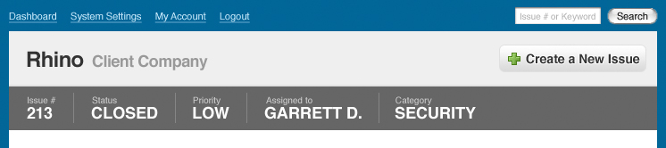
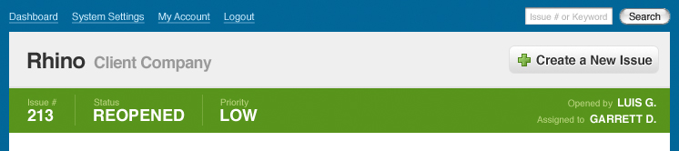
However, after spending some time with the new status bar, I saw much more potential for it. By adjusting the colors based on the status, it could serve as a sort of ambient indicator the issue’s status without any significant change to the design. (Figure 7)
I also realized that the first version of the status bar gave equal visual weight to all 5 of the primary pieces of meta data. As a result, they were all competing for attention. I chose the 3 most important pieces of information and decided the rest would have to go elsewhere. This actually turned into a nice opportunity to draw attention to the people most responsible for the issue, and the opener and assigned found a nice little home at the right edge of the status bar.
This is really only a brief glimpse into what was, in reality, a very long and involved process. However, in retrospect, it took me several years to get to the point where I could and would recognize these deficiencies and move forward in a constantly productive manner. In the past, I would know I wasn’t satisfied with something, but instead of switching gears, I’d just stay in that mode until I was 100% happy with the result.
Now, I’ve realized that each mode has a certain comfort level where I know I need to move on even if I don’t have all of the answers, and conveniently enough, by moving on to design or implementation, the answers eventually reveal themselves. It’s hard to say how valuable this will be to others, but given the amount of time it took me, I figured it was worth sharing.
A Quick Update
So, it’s been a little quiet around here since I was effectively working 2 jobs there towards the end of the year. Now that I’m out on my own and investing the majority of my time in the issue tracker, I should have much more to share. Right now, we’re doing all of the identity design, incorporation, and legal stuff, and almost all of my time between now and SXSW is dedicated to building everything out. Things are moving along nicely, I’ll definitely be sharing our progress on a much more regular basis now that I’m neck deep.