
As I mentioned before, status and responsibility are the two most significant aspects for helping make sure that issues make forward progress. My focus on responsibility manifests itself in more subtle ways, but with status, it clearly gets top billing throughout the visual design.
In the interest of ambient indicators, I knew I wanted a readily visible status bar and indicator that created a visual language for displaying issue status in different situations. While I like them, the colors aren’t set in stone. I primarily want to focus on the concept of using the visual design to reinforce the current status.
It’s worth noting that, for accessibility reasons, the color is only used to reinforce the status text when it’s displayed. Color is never the sole indicator of status. This is a subtle point that’s easily overlooked, but one that’s also worth mentioning.
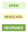
I designed a status bar that appears at the top of the page whenever viewing an issue. In addition to the status bar, I used the same colors to design a set of simple flags to help determine status when viewing a list of issues. 1 And just like that, I had a very simple and unobtrusive visual language for communicating status.
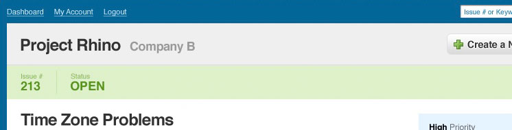
My first impulse was to use red to draw attention to open issues similar to an alert or warning. However, given that issues will be open, reopened, or resolved during the majority of their activity, it was important that the colors not be too distracting, and red was clearly overbearing. At the same time, it’s important that the colors don’t completely fade into the background. So, instead, I decided on a light shade of green to indicate open issues. It worked with the rest of the visual design and had the right balance of visibility and subtlety. (Figure 2)
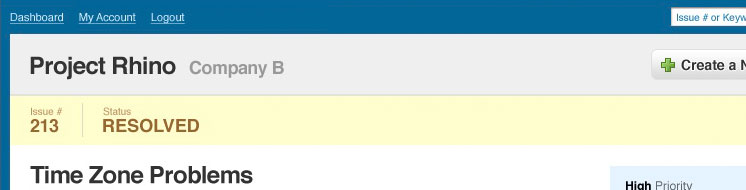
Generally issues will progress from open to resolved, and since resolved is the last step before closing an issue, I wanted to make it a little more urgent. At this point, the amount of effort required to close the issue should theoretically be significantly less than the effort required to fix it, so a bright, and somewhat more obtrusive color made sense. Resolved issues are yellow to do just that. 3
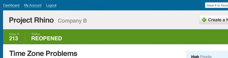
While we never want issues to be reopened, it happens, and since reopened issues are conceptually similar to open issues, I decided to stick with green. However, reopened issues are more urgent than regular open issues because they’re repeat issues. They needed to be a little bolder. So I essentially reversed the colors making the background a bolder green, and all of the active statuses were covered. 4
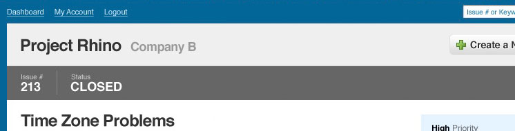
Finally, with closed issues, I went with a dark grey to indicate the lack of liveliness and ongoing activity. Without trying to get too morbid, a closed issue, is essentially a dead issue, and it made sense that a washed out color would efficiently reinforce that. I originally tried black, but it ended up being too dominant of an element. I also thought about red, but it was too alarming. So I went a few shades lighter and ended up with just the dark grey. 5
Summary
It seems like a little detail, but this actually ended up being a defining element of the visual design for the pages where it appeared. The flags are used not only for displaying lists of issues, but also to flag the comments in the comment stream so that one can quickly establish how an issue has progressed over time.
Ideally, there would only be two comments, one to resolve the issue and one to close it. However, in reality, comments will often turn into a documented conversation for clarifying, reassigning, or updating the pertinent details. So flagging the comments that actually update the issue status eventually begins to create a visual trail of progression and regression that covers the issue’s entire life-cycle, and we’ll look at this in a little more detail in the next post.