This update focused on three very closely related areas. The navigation in the header, the organization of the project and milestone listing page, and “smart return” which is our name for the way we maintain the state of the issue listing page for you so that you don’t have to re-filter it every time that you visit it.
Navigation

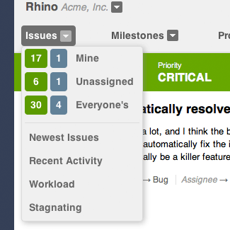
While the navigation hasn’t changed dramatically, we did make two changes that make a world of difference. The first is that we’ve simplified the “Issues” menu and added some convenient links. The added links behave as a set of informal reports so you can quickly view a variety of useful issue lists to help you stay on top of things.
- Newest Issues A list that organizes issues with the newest issues at the top to help ensure you haven’t missed anything new.
- Recent Activity A list that shows the most recently updated issues so you can easily see the latest updates.
- Workload A list to help get a feel for how active issues are distributed across the team so that you can ensure nobody is overloaded.
- Stagnating A list to help you find active issues that have been hanging around without any updates. This is usually a good sign that the issue needs to be closed or otherwise kickstarted so that it can be resolved.
The second, and more obvious change, is that we’ve added selected states for all of the pages so that it’s easier to know where you are within the application at any given time.

So, now it’s easier than ever to both know where you are and quickly get to another area.
Projects & Milestones
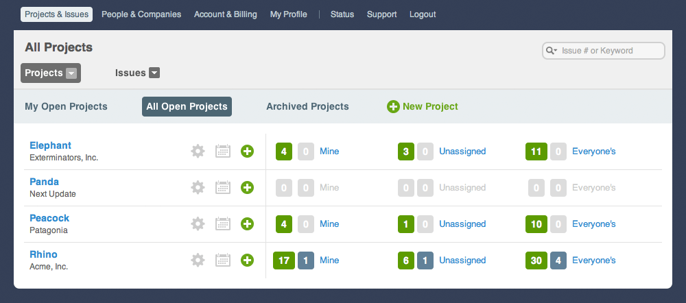
It seems that the work on the dashboard is never done, but this latest update will really help you evaluate which projects need attention as well as make it easier than ever to dive into a project and view the exact set of issues that matters to you.

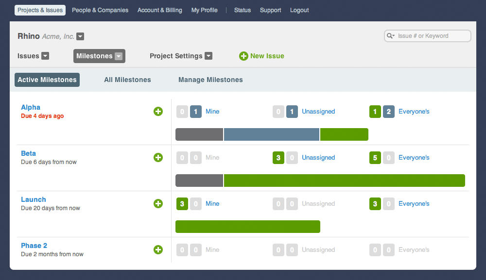
The milestone listing screen is a natural extension of the projects dashboard. It provides a similar level of insight but also adds status bars so that you can get a feel for how complete or incomplete milestones are relative to each other.

One thing you may have noticed is that the new navigation and dashboards are similar displays of the same information. The only difference is that the navigation drop down menus take the current context into consideration.

Smart Return
Finally, one of the nicest improvements is also one of the most invisible. With smart return, it’s one of those things that if we’ve done it right, you won’t even notice it. It’s composed of two pieces.
The first piece is keeping track of your “origin”. Every time that you create a project, company, user, or issue, you’ll want to get back to what you were doing before without too much trouble. We’ve always done this to a small degree, but now it’s better than ever, and we’ll always bring you back right where you left off whenever you perform one of these tasks.
The other half of smart return is smarter issue listing pages. Whenever you go to a project from the dashboard, issue menu item, or project switcher, we’ll reload the issue listing for that project just the way it was when you were last viewing the issue listing page in that project. Essentially, we save the state of the issue listing for each project, and when you return to that project, it will be just like you left it. You can switch to another project, and then come back, and each project will remember its own settings.
Summary
We haven’t brought any exciting new features just yet, but rest assured that what you see on the surface is only a fraction of what we’re working on to make Sifter better for you. These improvements should make it easier than ever to navigate Sifter and keep your finger on the pulse of your projects. We couldn’t be more excited about what we’re bringing next.