
The dashboard has been the one page that has probably seen the most iterations so far, and I imagine it will still probably evolve a bit more before it’s all said and done. However, I still wanted to share some of my thinking behind the design to this point. It’s primarily designed to communicate information about the current state and recent activity and enable quick access to create new issues.
One of the first high level aspects I want to address is the separation of active and inactive projects. The distinction between the two is implicit and the system automatically moves inactive projects out of the way when they don’t need attention. 1 They’re still readily accessible, but they don’t distract and add unnecessary visual noise to the page.
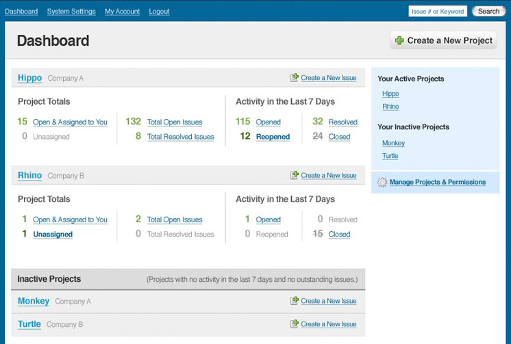
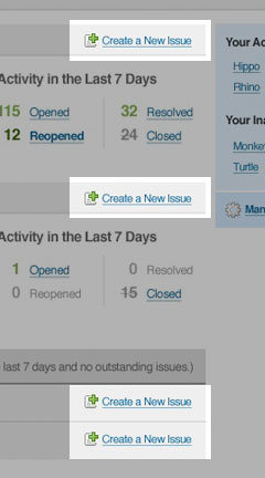
First and foremost, since every issue is associated with a single project, each project has its own page for creating new issues. It was important to me to only be one click away from creating an issue after an initial login. 2 So, each and every project, including those that are currently inactive, have a link for going directly to the issue submission form. While I generally prefer to minimize the use of icons, I felt the significance of the links justified one in this case.
Project Totals
The next area worth focusing on is the “Project Totals”. (Figure 3) This area serves two purposes for each project. First, it provides a quick project status with an emphasis on your personal responsibilities. And second, it provides links to take you directly to pre-sorted views of the relevant issues so you can get right to work without having to sort and filter to find your issues.
Responsibility
It’s very intentional that the first number and link for each project is for the issues that are “Open and Assigned to You”. This is just another example of where I let responsibility dictate the design. Similarly, you’ll notice that the “Unassigned” issues are in right there as well. While the unassigned issues will generally be taken care of by the project manager, it’s important for everyone on the team to be aware of them. Unassigned issues should always be a red flag because it means that nobody is accountable for that issue.
Of course, if I’m so diehard about responsibility, it would seem to be much easier to require that every issue have an explicit assignee. Unfortunately, given the fact that many of the issues will be input by clients or testers who have no idea who should be responsible for a given issue.
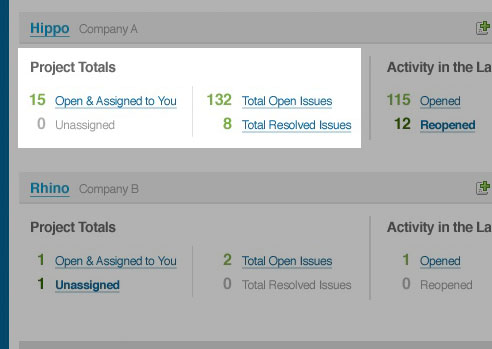
An alternative solution would have been to have a default assignee for each project, and that person would simply receive all of the issues that didn’t have an assignee specified. However, the problem with that solution is that it doesn’t allow for the team to keep an eye on it and take the initiative to pick up issues that will be assigned to them anyways. Ideally, that saves the project manager from having to explicitly assign and distribute every single issue.
Recent Activity
The last are I want to discuss is the recent activity. 4 While the other numbers help provide a quick understanding of where the project is at and just how much work needs to be done, the recent activity lets everyone know if it’s getting better or worse. It also helps bring attention to reopened issues which are always a concern because we really need to take the time to get things fixed correctly the first time.
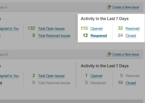
You may have noticed that the numbers and links for reopened issues and unassigned issues are bold and a darker shade of green. Both of these categories are a sort of red flag that needs attention sooner rather than later. So when there’s activity going on in either of these areas, we want to make sure it doesn’t get overlooked.
For the same reason, when there aren’t any issues for a given link, the link is removed and the text is changed to a grey so that it fades into the background. If there aren’t any issues for the given category, the link doesn’t really help, so we’re not losing any functionality. Instead, we’re putting the focus on the areas where attention is needed.
That was a really quick overview of a page that has seen no less than 5 major iterations, a lot of sketching, and a lot of deep thought to really understand what matters. I’m pretty happy with where it’s at and think it will probably end up pretty darn closed to where it is right now.