
With all of the thought that has gone into Sifter over the last year, and of all the iterations that we’ve created, there’s one page and set of data most clearly summarizes the unification of all of the pieces of Sifter into one coherent tool.
The Color Palette
The Sifter color palette has always been somewhat limited and derived from the colors of the rocks and dirt in the logo. However, it didn’t go much beyond the decorative aspects of color. Very little thought was put into how each color was applied to the interface. That’s all changing.
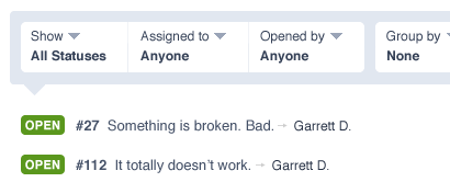
We now have a very explicit palette with unwritten guidelines that are beginning to solidify into clear rules. In the screenshot of the new issue listing, there are three major groups of colors.
These are the structure. It’s use is intentionally minimal, and it’s meant to provide a little bit of fun into an otherwise sterile tool. Most importantly, this is the one element where we decided to go a little overboard and breath in some life. It doesn’t fit the otherwise minimalist feel of Sifter, but we feel that it’s an important signature element that Sifter isn’t obsessively focused on work.

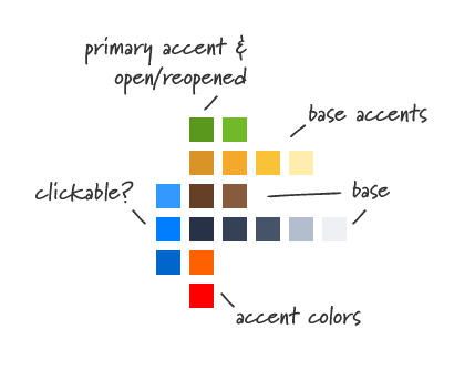
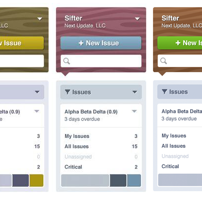
Browns & Wood Grain
These are the structure. It’s use is intentionally minimal, and it’s meant to provide a little bit of fun into an otherwise sterile tool. Most importantly, this is the one element where we decided to go a little overboard and breath in some life. It doesn’t fit the otherwise minimalist feel of Sifter, but we feel that it’s an important signature element that Sifter isn’t obsessively focused on work.
A more subtle and personal aspect is that the wood really reminds me of well-worn wooden handle on an old tool. While our version is decidedly more cartoony, I like the connections that it implies as I like to think of Sifter as the digital equivalent of a craftsman’s tools. A more realistic wood grain would feel too serious and uptight. It would also be visually busier, and that wouldn’t fit the the other design elements.

Interestingly enough, the wood gain inspiration came not from the application design, but rather from our efforts redesigning SifterApp.com. We were a lot more comfortable taking liberties and having fun with SifterApp.com, and as a result, we were able to come up with the ideas that helped provide the foundation for the new visual design of the application.
Blue-Gray
Instead of a simple grey as we’ve come to expect, for instance, on Mac OS X, we wanted to make Sifter be a little less sterile. All of the controls, filters, and navigation use a range of blues and grays. While the wood box in the upper left helps navigate between projects, the majority of the controls that affect the data are all within blue-gray boxes.
Green (and Red)
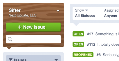
The previous two groups are intentionally boring. They’re muted like a well-worn tool. However, as a result, we’re able to use color more effectively to draw attention to the items that need it. While we use some red accents, the primary color for attention is green. As in “go”.

Fortunately, this is consistent with the current colors that we use to represent “Open” and “Reopened” issues in Sifter today. Green is our dominant accent color. Even the “new issue” button is green to relate it to the initial state of an issue which is Open, and thus, green.
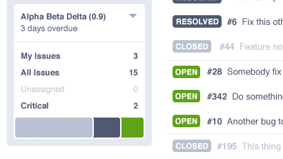
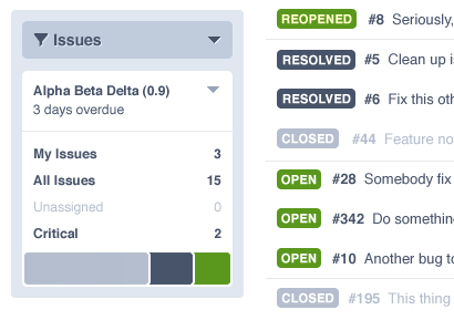
We’re also able to directly translate the status icons and colors into a milestone status bar that reinforces the overall status of a given milestone. The status bar can cleanly be divided into three colors each of which correspond to the colors of the status chiclets thus further unifying the color scheme and concepts.
Color-Blindness
Naturally, if we want to be careful about how we’re applying color, it’s important to consider the effects of color-blindness on our choices. While it does wash out the colors, each of the colors does retain it’s own individual signature relative to the other elements on the page.
Summary
Color is one of the most powerful options at our disposal for emphasizing or de-emphasizing information. Wielding it carefully with a larger vision in place can help unify related elements that can’t necessarily be unified via physical proximity.