
So, we can finally stop referring to it as “the bug and issue tracker”. It has a name, and that name is Sifter. The always amazing Jared Christensen has followed up the Next Update identity with this little gem for Sifter itself.
While there’s no way to tell if we’ll ever launch more products than Sifter, it was important for us to create a format that would lend itself to potentially being reused for a family of products with similar logos. Another thing that’s subtle but important is that it doesn’t have a catchy or subjective tagline. It just says what it is. No more. No less.

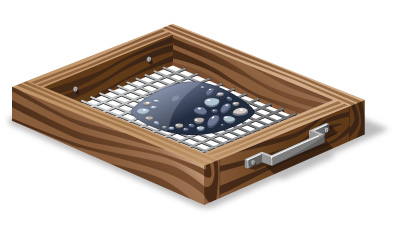
The average size doesn’t do it justice. So, here’s a big version for your viewing pleasure. Jared really put a lot of attention into the details, and it shows. The highlights, shadows, and other almost unnoticeable details really make a difference. If you’re interested, he’s gone into some of the finer details of creating the logo over on his site.
Working with Jared on the logo for Next Update and now Sifter has been a great experience. While Jared claimed this was his first time to really do any photo-realistic illustration work, I look at the result and can’t help but wonder if he’s lying.
Either way, we’ve got one more item checked off on the todo list, and we’re continuing to march forward. The last few months have been primarily about writing code, but as we’re coming to the end of a cycle there, I’ll be temporarily switching back into design mode for a while. As a result, we should have more posts about design decisions and possibly even a sneak preview screencast of a working application in the coming weeks.